Mini Review – Pen + Gear Blank (3×5) Index Cards

I’m not sure I need to explain the usefulness/necessity of index cards to you. I’m also not here to try and figure out what the best index cards in the world are (does Clairefontaine make any? If yes, then they’re probably the best). But WalMart does sell reasonably priced index cards under their in-house Pen+Gear brand (which is a poor name, but that’s not relevant, and I’m here to take a look at whether or not those are worth purchasing if you’re just looking for some (whichever) index cards.

(Note: I got blank cards, so I can’t remark upon anything concerning the ruling)

The dimensions of the cards themselves seem to accurately reflect the labeling, which is a good start. The paper is a bleached-white with a slightly pulpy texture that makes me think that over time or in sunlight these will become yellowed and brittle faster than your average paper products. This texture does make for a pleasant writing experience that is mostly smooth with a hint of feedback. Its ability to take ink and potential damage from eraser is about what you’d expect. Permanent markers, alcohol markers, and fountain pens will all bleed through, while even thicker fineliners (felt pens) don’t show through, and erasing doesn’t cause significant damage. If fact my only real gripe (though it is a big one), is that they are quite floppy for being “cards”. They’re flimsy, flappy, and easy to tear if handled frequently, meaning they would work poorly if one wanted to use them as say… index cards. Not only does this lack of stiffness detract from their main purpose, but it negates so many of the other things that index card were useful for in the past, like being structurally integral parts of craft projects. (Unfortunately, this can only knock the product down so far as, recently, I haven’t seen a brand of index cards that maintains the proper rigidity, so the best bet there is to make your own from card stock, I guess).

If you’re looking for small cut pieces of paper for various reasons, like taking quick notes, testing swatches of ink or paint (though they may buckle), or organizing recipes that you don’t handle often, these will work just fine. And even though they won’t really work for maintaining a card-catalogue (who even has those?) they aren’t exactly anything less than I expected for the price.


More Shapes in Playing Cards

Despite me having thousands (probably) of decks of playing cards there is one property they have with very little variance, and that is their rectangularness. Almost every deck of cards ever printed is rectangular, even though you’d think that with modern printing we’d just be making them in every conceivable shape. I’ve still got my hands on a few oddly shaped decks, though, and as I go through them, I think you’ll see that despite them being fascinating, there is a reason we keep the old rectangular design most of the time. (Of course it’s because they’re easier to print, hold, shuffle, and store. You already knew that, but more shapes are fun.)

Of course circular is the most popular, and the one I have the most examples of at 6. It’s the shape that is the most different from the standard rectangle, while still potentially being playable. Most sets use a simple pattern, where the illustration is in the center surrounded by 6 pips around the edge. It’s about as good a design as one could come up with for the shape, but it isn’t particularly easy to hold, both in general and in a way that allows one to see the pips. But on the table they look super cool, and they allow for strange back designs that make them “loved” by novelty toy companies that make things in China. My favorite’s the one with the world on the back, but the oldest one (by Waddingtons) with pink elephants is pretty neat too.

The third most common shape I’ve seen is surprising, but likely the most functional behind the standard. They are made by Umbra, a furniture and home décor company that apparently had some leftover cardboard (I joke, but a surprising number of décor and furniture companies have branded cards) and they’re five inch long, inch and a half wide oblong “capsules” (they have straight sides). This large shape and the ungainly rounded plastic containers they come in make them hard to store and cumbersome to take with you, but the minimalistic design with two pips and a line down the middle allow them to be easily understandable and the tall format with rounded bottoms makes them easy to fan out even while holding large hands. They might not be my first choice but maybe they’re an okay pack for vacations.

And now it’s time for the weird; if you want to be reminded of the wonderful days of summer when you’re dealing a hand there’re flip-flop shaped cards (mine are from Two’s Company, and not the ones currently available online) that are far too big but easy to fan out in your hand since the pips are printed on a part that curves away from the rest of the card. They also strangely have 3 different back designs randomly distributed throughout the cards because they couldn’t be bothered to make decisions with a straight head. And speaking of that there’s the “crooked pack” which introduces two angles into the middle of the cards in what I assume is an attempt to make them easier to fan, but has the side effect of making them impossible to shuffle, and that isn’t helped by the poor quality of their construction. Still, they are probably the most playable deck I’ve mentioned and for that reason they are actually still available (though mine say made in Hong Kong so they might not be exactly the same).

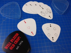
And since Chinese manufacturers tend to not ask questions, there are a ton from there, most coming in cheap clear plastic cases that match the cards’ shape, and the card quality is low enough that they begin to fall apart after a few plays. I’ve got a guitar pick deck that has the pips printed in such a way that you can only play with the deck in one direction (which seems to be upside down) and not very comfortably at that. Then there’s a deck shaped like a football, which literally just has regular playing card faces printed small enough that they fit inside the shape and thus are almost unplayable because there’s no way to hold more that a few and see the values on the card. And I have a heart deck that looks just as bad despite trying to compensate for the new shape.
But the absolutely worst shaped deck I have ever encountered is a little one shaped like a racecar, complete with an east-to-tear triangle for the spoiler. The deck is a master-class in not thinking: the design is too complicated to hold, shuffle, or easily put back in the case. The cardstock used is flimsy and easily tear-able, while the coating makes them slippery when being held. The pips are placed where they are hard to see while fanning the cards, and they are black numbers surrounded by a black circle (yes, all four 9s have the same pips, same for the 8s, etc.), and to make things just that little bit more confusing, they even changed out the regular suits for: helmets, trophies, flags, and wheels. They’re just a disaster, but you can still buy them at party-favor websites if you don’t want anyone at your party to have fun playing cards.

(Now, before the last paragraph here, I’d like to briefly mention a deck that had me fooled. Even though I had previously seen what was inside I still thought that the “Archideck” was a set of different shaped cards because of its “building” -shaped box, but alas, they just have boring pictures of New York buildings on them, and shame on me for being fooled.)

So is there a lesson to be learned from all that? Yes, I think: if you want to play a game, maybe just stick to regular cards, but other shapes are fun to look at and to mess with. If there is a better shape than the rectangle I haven’t found it yet, and I’m starting to think there probably isn’t and we got it right the first time. But, of course I do enjoy all these experimental decks, and getting one out to use every once in a while is still a fun thing to do.

Grimaud S.I.C. 4-color Playing Cards (Symmetrical International Cards) – In the Collection

I have more playing cards than is good for me, really. I’ve seen so many decks it sometimes seems like I’ve seen them all… usually until the next week, when I find something different. Often it’s just a different back, but there’s still room for me to be surprised with the faces. We haven’t yet perfected the design of the playing card, uniform as it might seem with the dominance of the USPCC (United States Playing Card Company {And to a lesser extent Cartimundi}). Every so often you find a deck that has been designed to meet a specific challenge, such as the Symmetrical International Cards (or S.I.C.) deck, in this case printed by Grimaud, the French playing card manufacturer (now owned by Cartimundi) (I don’t know if any other manufacturer ever produced these cards).

The S.I.C. deck is a design that sets about trying to solve two problems: left handed players wanting to fan their cards the opposite way, and asymmetrical icons on odd numbered cards (that are sometimes used to covertly signal other players). To solve these problems pips are placed in all 4 corners, and on the odd numbered, non-face-cards of 3 suits (diamonds is unchanged) the center pip is replaced by two pips that are slashed in half and meet at the middle. The slashes on spades are left-handed, and the slashes on hearts are right-handed. For clubs the icon now simply has 4 “petals” (leaves) instead of 3. The deck was developed by Michele Leone, a bridge player, to help stop cheating in that game. The design was used by the Italian Bridge Federation around 2010. And that is literally all the information I could find about it.

My particular deck(s) (the one shown here has a yellow back, and I have another with a green back somewhere), printed by Grimaud, also have the clubs and diamonds in green and yellow respectively, rather than their traditional colors. I suspect this is because they wanted to clear up some confusion that may result from having the pips on all 4 corners (I like it but from what I’ve read online it’s pretty divisive). I can find no reference to this deck online. I found it in America, with many other sets of bridge cards (mine isn’t in the original box, instead it’s in an “American Contract Bridge League” box. The cards that are supposed to be inside have quite a different design), and the face-card values are the English standard (J,Q,K). So I just have no clue.

They are one of the most well-thought-out decks of cards I’ve ever seen. Of course it’s not necessary unless you’re worried about people cheating at bridge, but it’s still a lovely design with an unobtrusive back, simple face-card design, and those really neat French-style clubs.

Business Cards

Every time I walk into an establishment I grab a business card. I almost never use this card to contact said establishment later, I just keep it with all of the other cards I have. There is absolutely no reason for me to be doing this, aside from the odd joke about me having a card for “My Shaman” etc.

So why in the world do I do this? Well, I just like to, and business cards can be useful. I know several (okay more than that) businessmen (people) who would get sick to their stomach at the idea of taking in more business cards than they already do. I’m sure many people routinely purge their business cards either from their systems entirely or import them into something digital and forget them. I don’t have enough business interactions nor do I walk into enough establishments that have prominently displayed cards for that to be necessary.

I (as with many things I acquire) like having them. But in this case I “can” (should I want to) use them later as well. When indexed properly I can easily find businesses or people in whatever area I’m in that I frequently go to and find contact info or even business hours (and since I’m in the middle of nowhere and many places have no web presence it’s sometimes the only way to find out information like that). And sometimes they are wacky and unique (see “Shaman” above), or pieces of art. But many times they are good examples of what not to do on a card, and upon occasion something you can point to as the best way to make a card ever (that would be my business card, I’m sure of it).

As far as collections go, this one is nice because it doesn’t take up much space and some people can understand why you would want to keep information easily available. And sometimes I realize I’m just a graphic design junkie and I like having all of the styles, sizes, and materials available for reference or brain training or something similar. The cards just look pretty sometimes, which just cements their place in my collections.

Review – Flex By Filofax Pocket

This review has been a long time coming. I first picked up the Flex by FiloFax pocket book a year ago from a surplus store as they were being discontinued in America (though I can find them on Amazon again now). I’ve never really been the organizer type and I didn’t know what I would use the item for, but it was cheap, and black goes with anything so I picked it up. How could I resist another notebook?

photo-59

So I have settled on a use for it, and it goes with me (almost) every day as my wallet (second wallet: my first one isn’t large enough to carry much cash and business cards as it’s attached to my phone). So this will be a review of the product as a wallet, and not the myriad of other things it could be used for.

photo-58

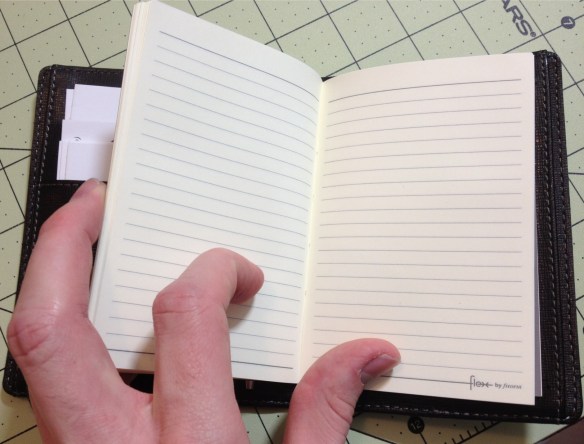
The book comes with two notebooks that I’ll cover first. One is a small, journal-type book, and the other is a tear-able (not a pun) pad. Both are good quality paper that’s fairly smooth, and can stand up to some fountain pens even, but they’re a bit stiff. They fit snugly into the slots on the cover and never seem too intrusive or fattening. Replacement books and other styles can be bought individually, and they are still good even if not protected in the cover.

photo-57

The cover has a leatherette feel to it (I don’t know the material) but it’s pretty strong and the spine is designed to be flexible so it doesn’t look bad or get destroyed by being opened and closed a lot. On the outside there’s nothing but stitching and a subdued logo, which I like. On the inside there are two panels, each has an inside-facing, and outside-facing pocket that are about business card size and can hold the notebook covers. One panel then has three card slots for business/credit cards or the pad, and the other side has only one slot for either the pad or any other item that FiloFax made to be put in there (I suppose cards would work there too, but there is only one slot). Finally, it comes with a thin piece of cardboard with a pen loop attached that can be inserted into the back pockets, allowing for one to easily take their pen with them.

photo-60

I personally have: business cards, cash, a small pen (Monteverde Poquito stylus), and all of the included items stored inside. The cover has held up well, with no signs of wear yet, and while I rarely use the books because I have so many other ones (and I’m not a fan of jot-pads) they do come in handy and can take inks that many cheaper papers can’t. I’ve had no problems with the spine or the pockets, and the stitching is still all there. I wish it was a little more customizable, but I wish that about everything.

The Flex is a quality product, as a wallet, organizer, or notebook. It is very customizable and very hardy. If one’s needs change, the Flex can change with them, and it seems to be built well enough to last through those changes. I really like it, and wish it was more widely available here (it might be now: I need to check up on it). It is on the bulky side, so it’s not for the minimalist, and more customizable options would be nice. But unless I see something great I’m not on the hunt for another wallet.