When working in the realm of physical creative utensils, it is difficult to have no need for an eraser. From school, to work, to the arts there is more often than not something that needs to be repositioned or removed, and a myriad of good options are available for doing so. Today, I’ll take a quick look at one of those options, the Pentel Hi-Polymer white eraser.
The eraser itself is about 1 x ½ x 2 ½ inches (around the same size as other erasers of this type, including the Staedtler Mars Plastic) and comes in a cardboard sleeve (the sleeve is more useful than I had imagined, but quite standard). But, of course, the real meat of the question is: what does it erase? And the answer I found was anything I could throw at it. It removed almost all pencil marks with either high or low graphite density, as well as light and medium charcoal. It removed significant portions of Prismacolor pencils and Conte crayons, while heavily smearing grease pencils (China markers). Obviously, up the difficulty scale at inks, it didn’t remove either Micron or Copic marks but did significantly fade the former (aside from a little fading most inks are bulletproof when compared to polymer erasers).
Those results are pretty impressive, and in my comparison are virtually identical to my old standby of the Staedtler Mars Plastic eraser (albeit, the Staedtler had a cool plastic case, which is why I use it), and since the two are essentially the same product, my recommendation would be to use the cheaper or more readily available of them. The Pentel Hi-Polymer eraser is a nice, high-quality consumable that’ll get the job done for just about anyone from amateur to professional.
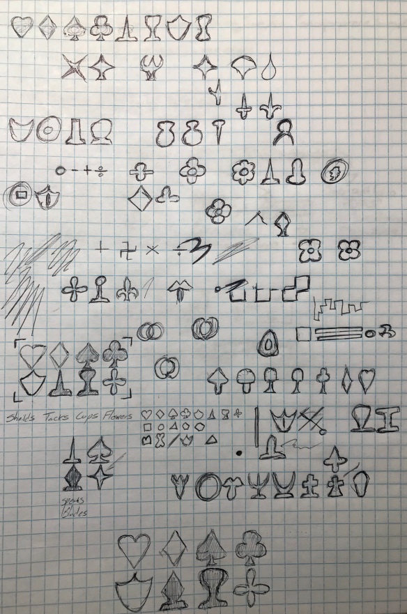
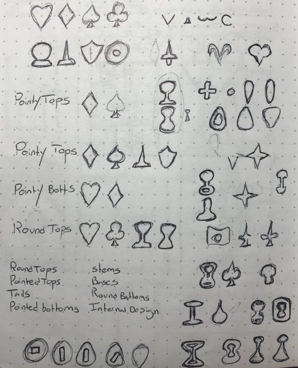
It isn’t much of a secret that I am fascinated by the idea of playing card suits. In fact, I’ve previously written an article on the subject. During my research into alternative suits (aside from the French hearts, spades, diamonds, and clubs, that is) I became so fascinated with the idea that I created my own set of four additional suits (being represented in a 104-card deck) which were revealed at the end of the aforementioned article. In the time since then, I have become less satisfied with these designs and more capable in my own design skills, which led me to attempt this project again.
The first thing I did was go back to my research, collecting again every attempt at a different set of suits that I had previously looked at. Then I reviewed as much additional information as I could (several comments on my previous post led me down interesting paths, and with the constant exponential increase in data on the internet, there were a myriad of options that had either been created or come to light since my previous search. Links to as many of these as possible will be provided at the end*).
I then created a master document where I cut out all of the various suits I had found and aligned them with all the others for comparison purposes (I also found that, strangely, some designs seem to have been “lifted” from elsewhere, which surprises me, one would think there wouldn’t be money in doing such a thing). I then reviewed the reasons that people had listed for creating each of these additional suits (at least, those that weren’t regional variations from centuries past) and found James Robert Watson’s methodology to be what I would consider the most sound (and his designs, in my opinion, the most successful). I reviewed the elements of the standard French design for the features that made them a cohesive set, and their symbolism. I then attempted to create as many different possible shapes that utilized these features and could be made to symbolize something easily recognizable (and, if possible, similar to those of the regional Spanish, German, or Italian suits).
One of the things that I noted when reviewing the myriad of ways others had attempted this challenge was that the symbols were often either too complicated or attempting to signify something more complicated than the 4 shapes they were meant to harmonize with. Indeed, looking at the 4 suits they don’t have that much in common aside from the “obvious” derivation of the spades and hearts. Perhaps a part of their cohesiveness is familiarity. I don’t have many symbols paired together in my life the way card suits are, but there is something pleasing about the 4 of them arranged in the abstract, even though they range in complexity from two lines to six, and don’t use lines that behave in consistent manners.
Upon studying these details, I laid out several rules for myself in constructing my additional suits:
A symbol must be made of either straight lines or simple curves.
A symbol must be horizontally symmetrical.
It is okay and, at times, preferable to have a symbol be derivative of another symbol.
All symbols must be easily differentiable at a glance without color being a factor.
A symbol may not exceed 7 lines (clubs, the previous highest, have 6).
A symbol must have characteristics such that it can be paired with at least one other suit and fit into a group of 4 suits.
A symbol must be passably recognizable as what it is attempting to symbolize.
A symbol must feel as if it fits with the others.
Admittedly, the last one is a bit subjective. However, during this run, cohesiveness in design was central to what I wanted to achieve. My previous attempt looked like everyone else’s, so I wanted to make something that was my own, that fit.
I sketched a series of designs starting with my previous attempt and working in some of what I have found in my research. I determined that in order to visually fit in, the designs had to represent items that could be considered “timeless”. Modern mechanisms just wouldn’t fit in, and there was a reason things like flowers or swords had been chosen as suits in the past (though often not as stylized).
Beyond those conscious decisions it is difficult to explain how an iterative process creates, so I will simply display the result, laid out in a way that I believe makes its connections to the source material apparent.
*
For my foray into the medium of charcoal I wanted to try as many varieties as possible (generally how I treat every artistic venture I endeavor on) but had a limited budget. Fortunately, they sell “raw” charcoal at department stores these days, in the particular case under the Daler Rowney brand at Walmart. But how does this willow charcoal compare to some of the other charcoal products that I’ve used? Let’s take a look.
Inside the box, there are 3 bags, each containing sticks of similar size (the bags being for small, medium, and large) that are approximately six inches in length. Now, I haven’t used any other brand of willow charcoal specifically, so my comparisons here will be to the similar vine charcoal and to compressed charcoal. In that regard, it is more scratchy and harder than vine charcoal, putting down a less consistent black that isn’t quite silky smooth and which smudges to be a more pale gray. The benefit of this is that it erases fairly easily, either with a cloth or an actual eraser.
Beyond that, there isn’t much to mention about the sticks as there are many natural inconsistencies with products like this that take plant material and bake it. The sticks themselves are quite fragile, but that just requires some getting used to and many artists pre-break theirs before starting on a project (what’s left can effectively be turned into a shading dust).
So, despite being from a big-box store, this product is entirely serviceable for an inexpensive price (not that charcoal is particularly expensive in the first place). It’s easily accessible and gets the job done, even making a nice addition to the drawing kit as a lighter, more easily workable material for sketches or laying out a work. It isn’t my preferred type of charcoal, but for a beginner (and perhaps even an expert), it’ll be entirely serviceable.
When looking at charcoals from afar, one of the last things you think about is how the necessary blending was achieved. Of course, there are many techniques for doing so on both large and small scales, with some being better than others. For those who want a simple replacement for their fingers and don’t have the patience to roll their own, packs of tortillons (rolled paper blending stumps) are available in most art stores or departments.
And really, there isn’t much to say beyond the fact that they do their job, and for a couple bucks you save the time of making them yourself (perhaps incorrectly). They’re one of my least favorite implements for blending and work best when you really don’t want to use your finger, and what you’re working on requires very fine detail (using a rag or a chamois is always preferable if you have the space).
While the paper isn’t of superior quality, it gets the job done, and the wrapping holds together through use and sharpening. If you’re looking for a blending stump there really is nothing else to it, and while someone somewhere likely has the best paper for the job, there’s nothing wrong with these ones.
As I’ve mentioned before, I haven’t significantly used charcoals in my artwork for most of my “career”, but recently stepped up and created a couple series using charcoal almost exclusively. For this I of course had to purchase most of the basic supplies for creating a charcoal drawing. As it happens, General’s produces a wide variety of inexpensive and readily available art supplies and they were the first ones I ran into when looking for compressed charcoal. I expected them to work, but not be anything spectacular. Was I right?
The set contains 4 sticks of charcoal that have been broken down and then compressed with a binder in 4 different hardnesses (2B{x2, in my pack}, 4B, and 6B). Each creates a relatively smooth and richly dark line that is very easy to smear and blend but very difficult to erase. The softer sticks do indeed create a darker and more consistent line but unsurprisingly seem to disappear in your hand while you’re using them. When compared to the “natural” vine charcoal these darker and more difficult-to-erase lines serve a different purpose: they are for further on in drawing’s development, when you are beyond the sketching stage and have most of the structure of your image created.
In my experience, these General’s sticks performed adequately. They were certainly darker and smoother than cheaper ones found in “sketching kits” that you can buy at department stores. However, they do still go down in a bit of a “chunky” pattern and aren’t true black. There is also a bit of a problem with breaking, but that’s just par for the course with this type of product. If you’re used to crayons, you’ll have to be very careful when handling these, or you can be like many artists I’ve seen and “pre-”break them in half before actually using them, which also makes it easier to get in close and work on detail areas.
These guys pretty much keep pace with a lot of General’s products. They work well, are easily available, and don’t break the bank (though they’re actually closer to the top end of the price spectrum in this case). They are a fine solution for people at all skill levels with the studio space to set up and use charcoals.