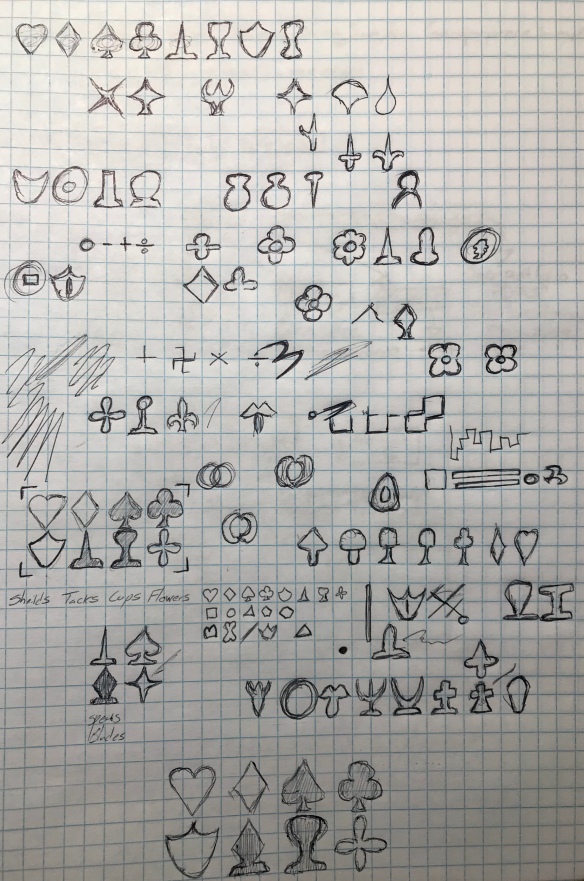
It isn’t much of a secret that I am fascinated by the idea of playing card suits. In fact, I’ve previously written an article on the subject. During my research into alternative suits (aside from the French hearts, spades, diamonds, and clubs, that is) I became so fascinated with the idea that I created my own set of four additional suits (being represented in a 104-card deck) which were revealed at the end of the aforementioned article. In the time since then, I have become less satisfied with these designs and more capable in my own design skills, which led me to attempt this project again.
The first thing I did was go back to my research, collecting again every attempt at a different set of suits that I had previously looked at. Then I reviewed as much additional information as I could (several comments on my previous post led me down interesting paths, and with the constant exponential increase in data on the internet, there were a myriad of options that had either been created or come to light since my previous search. Links to as many of these as possible will be provided at the end*).
I then created a master document where I cut out all of the various suits I had found and aligned them with all the others for comparison purposes (I also found that, strangely, some designs seem to have been “lifted” from elsewhere, which surprises me, one would think there wouldn’t be money in doing such a thing). I then reviewed the reasons that people had listed for creating each of these additional suits (at least, those that weren’t regional variations from centuries past) and found James Robert Watson’s methodology to be what I would consider the most sound (and his designs, in my opinion, the most successful). I reviewed the elements of the standard French design for the features that made them a cohesive set, and their symbolism. I then attempted to create as many different possible shapes that utilized these features and could be made to symbolize something easily recognizable (and, if possible, similar to those of the regional Spanish, German, or Italian suits).
One of the things that I noted when reviewing the myriad of ways others had attempted this challenge was that the symbols were often either too complicated or attempting to signify something more complicated than the 4 shapes they were meant to harmonize with. Indeed, looking at the 4 suits they don’t have that much in common aside from the “obvious” derivation of the spades and hearts. Perhaps a part of their cohesiveness is familiarity. I don’t have many symbols paired together in my life the way card suits are, but there is something pleasing about the 4 of them arranged in the abstract, even though they range in complexity from two lines to six, and don’t use lines that behave in consistent manners.
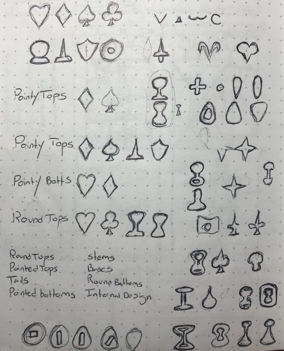
Upon studying these details, I laid out several rules for myself in constructing my additional suits:
A symbol must be made of either straight lines or simple curves.
A symbol must be horizontally symmetrical.
It is okay and, at times, preferable to have a symbol be derivative of another symbol.
All symbols must be easily differentiable at a glance without color being a factor.
A symbol may not exceed 7 lines (clubs, the previous highest, have 6).
A symbol must have characteristics such that it can be paired with at least one other suit and fit into a group of 4 suits.
A symbol must be passably recognizable as what it is attempting to symbolize.
A symbol must feel as if it fits with the others.
Admittedly, the last one is a bit subjective. However, during this run, cohesiveness in design was central to what I wanted to achieve. My previous attempt looked like everyone else’s, so I wanted to make something that was my own, that fit.
I sketched a series of designs starting with my previous attempt and working in some of what I have found in my research. I determined that in order to visually fit in, the designs had to represent items that could be considered “timeless”. Modern mechanisms just wouldn’t fit in, and there was a reason things like flowers or swords had been chosen as suits in the past (though often not as stylized).
Beyond those conscious decisions it is difficult to explain how an iterative process creates, so I will simply display the result, laid out in a way that I believe makes its connections to the source material apparent.
*
Every time I walk into an establishment I grab a business card. I almost never use this card to contact said establishment later, I just keep it with all of the other cards I have. There is absolutely no reason for me to be doing this, aside from the odd joke about me having a card for “My Shaman” etc.
So why in the world do I do this? Well, I just like to, and business cards can be useful. I know several (okay more than that) businessmen (people) who would get sick to their stomach at the idea of taking in more business cards than they already do. I’m sure many people routinely purge their business cards either from their systems entirely or import them into something digital and forget them. I don’t have enough business interactions nor do I walk into enough establishments that have prominently displayed cards for that to be necessary.
I (as with many things I acquire) like having them. But in this case I “can” (should I want to) use them later as well. When indexed properly I can easily find businesses or people in whatever area I’m in that I frequently go to and find contact info or even business hours (and since I’m in the middle of nowhere and many places have no web presence it’s sometimes the only way to find out information like that). And sometimes they are wacky and unique (see “Shaman” above), or pieces of art. But many times they are good examples of what not to do on a card, and upon occasion something you can point to as the best way to make a card ever (that would be my business card, I’m sure of it).
As far as collections go, this one is nice because it doesn’t take up much space and some people can understand why you would want to keep information easily available. And sometimes I realize I’m just a graphic design junkie and I like having all of the styles, sizes, and materials available for reference or brain training or something similar. The cards just look pretty sometimes, which just cements their place in my collections.
It’s always nice to try new mechanical pencils, and I’ve been looking at a few recently. One that is around what might be considered “medium territory” is the Paper:Mate Design pencil (7mm #2), which has a few nice features that make it nicer than some others I’ve looked at.
Starting at the mechanism, the button is quite small and has a slight angle to the top so that one’s fingers will just slide off that much easier. That being said, it works quite well. I haven’t had any issues with it, and the click is both minimal and satisfying. Removing the metal sheath reveals the eraser, which does its job. Removing the eraser gives one access to the lead, and removing the eraser holder allows one to disassemble the pencil, which is handy (one would need to unscrew the front to do that). Down from that is a clip with the Paper:Mate logo. It needs some finesse to clip on, but both holds well and is fairly easy to detach. The barrel is a medium-sized metal tube with a nice finish that simply says Paper:Mate (personally I’d’ve liked more info, but that is literally only me). The grip is a fairly hard rubber with several lines running parallel that don’t seem to do anything to improve grip. It is a bit slippery, but not to a degree that it will distract you unless you’ve used a ton of pens and pencils. There is a metal cone that leads to a smaller, retractable metal cone tip the lead flows out of. This retractable tip means that the pencil will not scratch the inside of a pocket or something, which is quite nice.
The lead is alright. It is standard HB but feels a bit smoother and more break-prone than other brands of HB I’ve used. That being said, it’s broken about the same amount. I was at first apprehensive when using this pencil. It has no shock-absorbing spring and when one pushes down just after clicking, the lead retracts and makes a distracting clicking sound. This is a major problem in pens for me, and hearing the sound again and again drives me crazy, but fortunately this pencil holds the lead tight enough that I only ever hear the sound at the start of a writing session. What it does mean that is annoying, though, is that if the lead is only advanced a slight amount, a problem this pencil tends to have, then one can easily push the lead back into the pencil and be unable to write. This is actually not as major a problems as it sounds, but I feel it should be mentioned.
Overall, this pencil exceeds my expectations. The retracting point and stainless steel barrel are nice features. And aside from a few minor things, everything else does its job well enough. The pencil really feels solid and good in the hand without being too heavy, and the writing experience is quite smooth. If you’re looking for a tough mechanical pencil for some mid-length writing sessions, I’d seek one out, though if you’re in an extremely demanding location or are writing for a long time (the grip is poor) you might look elsewhere.
Ah, the pencil, the fundamental unit of art (mostly). Many people will try to tell you there is a difference in the performance of different brands of pencils. While there may be it is so small that it is almost unrecognizable. The main difference between pencil brands are the aesthetics and feel. So I’ll leave finding which hardness of lead you prefer and focus on the feel of the Sanford Design pencils.
The lead obviously comes in all hardnesses, and I can verify that it does actually write. But that is not he major factor in choosing a pencil, really. This variety of pencil feels good in the hand to me personally. They are slightly smaller than the regular number 2 school pencil, and maintain the slightly uncomfortable ridges of their hexagonal design. But being small the ridges are less noticeable and help with grip on an otherwise smooth and slippery pencil. The writing on the side is clear but shiny, and in glare is hard to read, but from my experience doesn’t wear off. It has a nice feel in the hand and is not prone to slipping, but after continued use the corners do tend to dig into ones hand.
This pencil variety is my pencil of choice when it comes to art, though it doesn’t have an eraser the comfort and better lead (when compared to school pencils) makes up for it. Although I will admit that the main reason I use it is because the art stores I frequent carry it and not another brand. I recommend trying out a bunch of different pencils to see which you like best.