Review – Sharpie Clear View Stick Highlighter

I would imagine that somewhere within the companies that produce writing implements there is an R&D department or team, whose task it is to come up with new products that will sell and grab market attention. I would also imagine that this job is fairly difficult at this point. Not only are physical writing implements perceived as being on the way out, but those that are around have been honed for decades to be exactly what the markets are looking for. In other words, I’m not entirely sure the motivation behind “improving” highlighters with the Sharpie Clear View highlighter was actually an intention to make the product better. But maybe it does. Let’s take a look.

The main bodies of the pens are a matte plastic matching the color of the ink. They’re more ovular, rather then entirely cylindrical, and they taper down to the end more in one direction than the other, making their ends appear squished (or chewed on, like the ends of many pens I’ve seen). Underneath the cap is a shiny black plastic section that is slightly more slippery than the body but doesn’t really impede use. This tapers down slightly and from it protrudes a very angular, chisel-shaped felt highlighter tip. Inside this tip is a similarly shaped piece of clear plastic that both holds the tip in place and allows the user to see through it. The cap is made of a frosted plastic to allow one to see the special tip through it and the packaging, while being soft enough to not shatter easily (like many clear plastics would). It has an integrated clip and posts securely, but with a strangle wobbly feel from the “squished” rear.

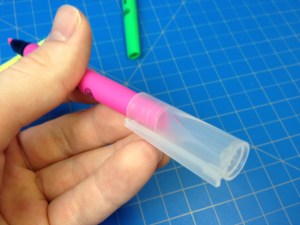
The three colors that come in the package are your standard highlighter colors: pink, yellow, and green. Each is quite bright and visible, but doesn’t block whatever is being highlighted. Green is the darkest, and is a color almost unusable in some highlighters, but here it is serviceable, if my least favorite because of the “shading” pools that tend to form at the start and end of a highlighted line. Pink is slightly better at this, and of course yellow trumps both in the visibility of words beneath it, its own visibility (in good light), and lack of shading. Sharpie’s smear guard is still working as good as ever and most inks can be highlighted without trouble (but some water-based inks are more unhappy about it than others). And then there’s the main feature. After using it, I don’t get it. It is technically possible to see through the highlighter so you know what you’re highlighting and when to stop. But if you didn’t know that going in what were you thinking? And the angle you have to hold the pen at to see well isn’t a very comfortable one. I mean, I can’t fault it for “not working”, but I just don’t understand how it’s supposed to be used. It doesn’t make anything easier or better, it’s just there.

If you’re looking for a set of highlighters, these work, and if you find them at around the same price as normal highlighters (the price fluctuates) I’d say get them (it doesn’t hurt). But I wouldn’t go out of my way for them, or pay much more. I can’t see their gimmick as anything more than that, and it doesn’t work for me.

Review – Sharpie Colors Part 5 Reds – Red, Pink, Pink Lemonade, and Magenta

We’re five parts in to my look at the various Sharpie pen colors I have. This time I will be looking at some of the various shades of red.

photo-96

Red – The red itself is a deep, dark color. It’s close enough to the color of a red rose, and surprisingly (or unsurprisingly if the dye for both is those red bugs) ketchup. It’s not very aggressive or eye-hurting, but it stands out and is good for marking and work-appropriate. It’s not the best or worst on the bleed-through side of things, but has almost no shading or feathering. It’s a good color, if a bit boring.

sharpie colors reds

Pink – The pink is also a bit like a rose, not getting quite to the obnoxious hot pink style, but still bright and visible. It’s not the most natural color, but it does separate things out from the crowd. Bleeding is again medium, feathering and shading are a bit more pronounced than on the regular red, though.

Pink Lemonade – Pink lemonade is indeed the color of pink lemonade, or of a pink crayon or candle (something wax). It’s not unpleasing, but it’s also not a color I would keep coming back to. It’s fairy flat and doesn’t really pop out, but is differentiatable. Bleed-through and feathering are pretty bad, and shading is noticeable, though not too much.

Magenta – And now for the final color I’m a bit dubious about. I think it’s magenta. It’s a very deep pinkish color (should I say again like a rose? Roses occur in so many colors) which I can’t find many natural parallels to, nor any really solid work applications. It does look pretty (I guess) but that’s about it. Bleed-though and feathering are terrible with this one, but no shading is evident.

And that’s the reds. They look like flowers, and don’t work well at the stereotypical workplace. They work for organizing, but have some pretty extreme properties. They’re certainly the most eye-catching of the bunch (other than yellow).

Next week I’ll look at the Oranges (and yellow)

Review – Expo Ultra Fine Pink, Purple, Orange, and Brown

I’ve looked at the 4 most common Expo marker colors (specifically in the Ultra-Fine tip) in the last few weeks, and this week I’ll look at 4 of the lesser-seen colors: pink, purple, orange, and brown.

photo-52

Pink- to start with, the pink is a nice, dark pink that looks much more pleasant than the common pinks found in writing utensils. It’s rosy, and very consistent; the line width is medium, though.

Purple- next, the purple is a very bold writer, it goes on smoothly and with a lot of ink, but there is more variance in the color when dry. It is a nice, dark purple, and unmistakably so. It might be confused with black from far away, but is generally distinguishable.

Orange- the orange is very thin, both in line and in color. It’s sometimes hard to tell it’s there at all, and there is a wide color variance within it. I’m not a particularly big fan of it.

Brown- and finally the brown, which is another wide-writer. It writes smoothly, with the only color variance being in the tips. It’s a dark enough brown to be easily read, and still distinguishable from the other dark colors.

Overall, these 4 are a nice addition, though they aren’t my favorites, either in performance or in looks. I like them, but if I were just getting these for a class I would skip them. For organization, note-taking, and art, these colors have a better purpose, but those aren’t the main purpose of dry-erase markers.

Review – PaperMate Flair Colors – Orange, Lime, Magenta, Marigold, and Pink

Now it’s time for part two of my look at the 20 colors of the Papermate Flair. This section of five is the “Warm” colors section. Mostly some normal colors here, but a few out-liars. Nothing too crazy.

Papermate flair colors part 2

This scan didn’t work the best


Orange – The orange is a deep, red-ish orange that is surprisingly natural looking. It’s very subdued, but noticeable, good for organization, but not for documents. It’s dark enough that it can be read at a glance. It fades significantly, but doesn’t really smear when wet.

Lime – The lime likely has the most variance in color, when written with fast it is a surprisingly standard bright lime color, but when taken slowly it is rather dark and subdued. It wouldn’t make a great office color but it is less harsh than a normal lime green, and the variances in tone make it good for art. Another plus is water hardly affects it.

Magenta – I find magenta colors had to classify, this one is pretty, nice to look at, and readable. It wouldn’t suit the office well but it does look like I could see it out my window. Heavy bleeding and smearing when wet with this one.

Marigold – At first glance this pen looks like another yellow, which it is, but much less harsh and more readable. It has a tinge of orange that is very pleasant and flower-like. There’s a lot of smearing, but almost no fading when exposed to water. Perhaps it could be used as an alternative to red to use when marking something important. Just as noticeable, but less aggressive.

Pink – I don’t like this color, it’s a hot-ish pink, not blinding, but not pleasant. It’s standard all things considered, it barely moves when wet and is inappropriate for anything but personal organizing. I’m not judging you if you like it, but I won’t be using if for anything.

And that’s part two. I like the warm colors, but I struggle to find uses for them. Next time I’ll take a look at five more, but this time “Cool” colors.