Speak Your Mind 177 #881-885

QUESTIONS

1. Are you as tall as your grandmother?

2. What color do you think goes best with green?

3. What do you most like about zoos?

4. Which do you like best: slip-on shoes to tie shoes?

5. Do you think you will ever use a computer after high school?

ANSWERS By: Austin Smith

1. I believe I am taller than both of my grandmothers were.

2. Blue probably.

3. Being able to see animals I’d never see otherwise.

4. Slip-ons all the way baby.

5. I have been for two years now so…

Review – Papermate Inkjoy Green, Pink, Orange, and Light Blue

In a previous entry I looked at the more standard Papermate Inkjoy colors, now it’s time for the less standard colors, like light blue, pink, orange, and green.

inkjoy tests 2

The light blue is a sky-colored blue. It is the hardest to read of any of the Inkjoy colors, though it is still fairly visible when not cluttered. It has a very natural feel and is very sky-like. It is very neutral anyway. It doesn’t look like a color that takes a stance, if that makes any sense. It’d make a nice color for both drawing and work.

Next pink, which thankfully isn’t a very aggressive pink. It’s definitely not hot, it’s more of a magenta color, but not quite. It is not a very natural color, though, as it doesn’t look like a rock or a flower. Might be good for a personal thing, or some corrections or something similar.

Third is orange, which I must say looks almost exactly like Pilot G-2 Orange, which I have previously reviewed. Subtle, but not very useful, perhaps flowers or the fruit, but it could be work-friendly, if you’re in a less formal office setting.

Finally green, which is a quite deep, more forest color. A very natural and neutral color. Again a fine informal office color, and a nice forest or swamp color. Though very limited in its natural colors. One of the least useful, but most usable, colors in the set.

Overall these four colors are unintrusive and subtle, with various office and home applications, but very little artistic applications save a few specific places.

Review – Pilot G2 Colors – Black, Blue, Red, Green, and Purple

I don’t believe I have talked about G2 Pilot gel-pens before, I will do a full review later, but first I want to talk about most of the different colors that they come in. I have collected 15, and will split them into three groups, the first of which is the “normal” colors of black, blue, red, green, and purple.

ink tests

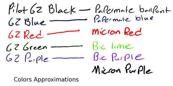
Starting with the black: it’s black, there is literally nothing special about it. It is a bit of a warm black, and it goes on smooth. It doesn’t have any magnificent qualities, it is just an all-around black.

Now for the blue, which is a fairly dark but basically standard blue, very similar to the black. It is probably one of the darkest standard blue pens available, and it is a fairly cool blue, like a deep lake. Again, though, it has nothing particularly special to offer.

The red is a medium red, which is a bit different. Most companies go for either an eye-bleedingly light red, or a deep red that is much more pleasant. As far as reds go this is in the middle, but it certainly isn’t neutral. It has no tint of pink, and is most definitively, starkly, red.

The green is surprisingly dark for a standard green. It’s almost a grassy color, and not the light, lime-ish color most other companies associate with green (it’s like the cherry flavor of pens). It is definitely green, but is unoffensive and pleasant. It sticks out, though, making it seem like one of those “replace red because it hurts people’s feelings on grades” pens (I’m no psychologist, so I know nothing about whether that is good or bad, it’s just what I thought of). I think it’s nice.

And finally the purple, which is the black sheep of the normal colors. It is a light, almost violet or deep rose color. It is warm and goes on a bit less smoothly than the other colors here. I really don’t like it, it’s just far too light, and it doesn’t go with the deep other colors at all. It really won’t stick out on a paper either, so it’s just kind of there, it has no natural color akin to it, so it has limited art utility as well.

Overall these are a very good set of office colors, and if you’re just looking for some smooth-writing different colors that aren’t too wacky, I’d look here first. But they do all have limited art potential, so you may want to delve further to get just the right color in that case.


Review – Sharpie Pen Colors

I have reviewed the Sharpie pen before. And the ink in that pen was a bit of a muted black. Now it’s time to look at some more of the Sharpie pen color palette: the blue, red, green, purple, and orange pens.

pen comparison sharpie 2

Colors not exact representations.

Starting off with the blue, which is a typical blue, if a bit washed-out looking. It is a subdued blue that would be appropriate in most work environments. They say that all of the colors are water-proof and smear resistant. I will say that is mostly true unless under extreme circumstances, but don’t expect them to be as all-around useful as their marker cousins. They also dry fairly fast and are supposed to be non-toxic, but I’m not checking that.

Now to the red, which is the most disappointing of the bunch. It is faded and looks almost pinkish. It’s hard to tell it’s really a red and it certainly lacks the intensity most look for in a red ink. That being said, it is subdued and will work better in a work or school environment where one would want a less aggressive color.

The green is, say it with me, subdued. It is undeniably green, and being as laid back as it is almost intensifies it. It’s the hardest to read out of the bunch and is almost eye hurting after a while. Strangely it is almost identical to Micron green.

The purple is flat, but deep. It is easily the darkest and most readable of the bunch. It is also fairly close to a Micron purple and provides a nice, neutral color, that is still quite different.

Now finally the orange. The orange is the only intense color out of the bunch, and even then for orange it is fairly flat. It does jump off the page and provide the kick one would expect from a nice orange. I’d say it’s probably the best color of the bunch.

So there are a few colors. Aside from looking almost identical to Micron colors I’d say they’re good. I haven’t the foggiest as to why that is but it is a bonus in my book. Anyway, if you like Sharpie pens, and want some nice, pleasant colors for work or some such, I’d take a closer look at these. And due to their subtlety they also look much more natural in drawings than standard, intense colors.

Review – Micron Red, Blue, Purple, and Green colors

I have reviewed several Micron pens in the past. But in case you were wondering if they could add a little more color to your life, here are some Micron Colors in .05.

It is an eight-pen set of colors from Micron that I’m looking at. It includes black so that’s out. The first four colors I will look at are what I call the ‘standard’ colors. They are red, blue, green, and purple.

I have already talked about the blue and the red so I’ll cover those quickly first. These pens are larger than the ones I reviewed previously so the ink is a bit more saturated. They aren’t as glaringly red and blue as before, but they are still some of the brightest and most vibrant of their colors on the market, aside from the awful nano-liner. Getting this large also makes them more prone to bleed-through, of which there is a slight hint in the blue.

Next we have the purple, which, in the Micron style, is a very aggressive purple. It is very deep, and in low lighting could be mistaken for black. It is very highly saturated, and changes little to none when applying pressure for some time to just tapping it on the paper. Amazingly at this darkness it isn’t very prone to bleed-through.

Finally the green. This is, surprisingly, a fairly sedate green, falling in the middle of forest and lime. It is unmistakably green, but rather unremarkable. It doesn’t jump like the other inks in this set. It just sits there, making it rather like greens in real life which you have to look closely to appreciate. Again, surprisingly enough this color is the most prone to bleed-through in the entire set, even writing fairly fast it leaves dots on the other side of fairly thin paper.

micron color test 1.1

So overall the ‘standard’ colors in this Micron package are great. They’re not really the best for sketches of nature or the outside world, but for labeling and organizing they are great. For example, different color parts in a schematic. It’s nice to have colored pens around and these hold up the Micron standard. I can definitely find a use for them.