Review – Pilot G2 Teal, Hunter Green, Navy, Periwinkle, and Caramel

This week I’m gonna take a look at some of the weirder colors of Pilot’s G2 pens. Let’s dive right in.

third pilot pen comparison

First up is teal, which is a deep, bluish-green, almost like an aquatic plant. It’s very subdued and seems almost workplace-friendly (sort of like a blue-black, but with green). It goes on the page a bit thick and is a bit of a hard start when it’s not been written with for a while. A very soothing color overall.

Next up is hunter green, which is a deep, swampy green. It looks like a camouflage color, which I guess it’s supposed to. It isn’t the most pleasant of colors to stare at, but it is quite subtle. This color is probably the thickest ink and has the most problems with startup and skipping of the bunch.

Third is navy, which is a blue-black. It doesn’t really remind me of any previous navy colors I’ve seen, it is simply a very dark blue, but not a deep blue. It looks just like a combination of blue and black. Very work-friendly, I would say, but has no real art application save for maybe a night ocean.

Fourth is periwinkle, which is a light, sky blue. This is one of the lightest and easiest to read light blues I’ve seen. It isn’t quite as light as possible, but that makes it readable. It has a bit of shading (inconsistent color) but not too much. This is likely the most versatile ink color of the bunch, being a close to work-friendly “happy” color, and a realistic color that could be found in both water and skies.

And finally is caramel. Caramel is a light, almost hard-to-read brown. Again it is subdued enough to not hurt one’s eyes, but is very light and not particularly pretty. It does flow well, and really looks like caramel, so if you need a caramel colored ink, this is the ink for you.

That concludes my look at the Pilot G2 pen color types. I hope these were useful, they really do cover the gamut and provide ink colors for a variety of different uses. Unfortunately, I believe they only come in a large, expensive pack, so I would recommend having uses for a few of these pens before purchasing them.  They are great reliable writers with most of the ink colors, especially the more common ones (which are available individually) and can be used almost anywhere.

Review – Pink, Orange, Turquoise, Burgundy, and Lime

And now for five more Pilot G2 colors! These are the the more “regular” colors, but just a bit different, so let’s go.

pilot pen comparison

The first is pink, which is very pink. It’s probably the brightest and most visible color in the set, though it fortunately isn’t an eye-searing hot-pink. It runs fairly thick and as pinks go, is quite deep, closer to red than to rose.

The second is orange, which is fairly bright, the second hardest to read of the bunch. It is plainly orange though, and will be a stark contrast to any other color in the set. Like most of the other colors, though, it is done well, and is not painful to look at or too difficult to read.

Next we have turquoise, which is a greenish-blue color. Honestly, it just looks like turquoise, which is a very pleasant color. It’s appealing and subdued, it almost looks like sky or clear “caribbean” sea. It’s a fantastic color, especially if you want a bluish color, but a bit lighter and happier.

Fourth is burgundy, which is a deep, purplish red. It’s almost like a red-black. It is very readable on the page, but gives writing a bit of flair not seen in a red, black, or purple ink that would be close. The ink is a bit thick though, and has some starting problems, but that just means it should be used more often.

And lastly for this set is lime, which is obviously a very light green. It actually looks nothing like a lime (like most colors called lime). It is the hardest to read of the bunch, but still isn’t quite offensive to the eye, though I wouldn’t write with it. I think it’s still the worst here, though, as it doesn’t match the nice qualities of the rest of these inks, and it’s a bit dry on the page.

Next up are the more uncommon colors.

Review – Pilot G2 Colors – Black, Blue, Red, Green, and Purple

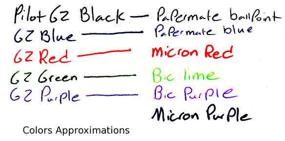
I don’t believe I have talked about G2 Pilot gel-pens before, I will do a full review later, but first I want to talk about most of the different colors that they come in. I have collected 15, and will split them into three groups, the first of which is the “normal” colors of black, blue, red, green, and purple.

ink tests

Starting with the black: it’s black, there is literally nothing special about it. It is a bit of a warm black, and it goes on smooth. It doesn’t have any magnificent qualities, it is just an all-around black.

Now for the blue, which is a fairly dark but basically standard blue, very similar to the black. It is probably one of the darkest standard blue pens available, and it is a fairly cool blue, like a deep lake. Again, though, it has nothing particularly special to offer.

The red is a medium red, which is a bit different. Most companies go for either an eye-bleedingly light red, or a deep red that is much more pleasant. As far as reds go this is in the middle, but it certainly isn’t neutral. It has no tint of pink, and is most definitively, starkly, red.

The green is surprisingly dark for a standard green. It’s almost a grassy color, and not the light, lime-ish color most other companies associate with green (it’s like the cherry flavor of pens). It is definitely green, but is unoffensive and pleasant. It sticks out, though, making it seem like one of those “replace red because it hurts people’s feelings on grades” pens (I’m no psychologist, so I know nothing about whether that is good or bad, it’s just what I thought of). I think it’s nice.

And finally the purple, which is the black sheep of the normal colors. It is a light, almost violet or deep rose color. It is warm and goes on a bit less smoothly than the other colors here. I really don’t like it, it’s just far too light, and it doesn’t go with the deep other colors at all. It really won’t stick out on a paper either, so it’s just kind of there, it has no natural color akin to it, so it has limited art utility as well.

Overall these are a very good set of office colors, and if you’re just looking for some smooth-writing different colors that aren’t too wacky, I’d look here first. But they do all have limited art potential, so you may want to delve further to get just the right color in that case.