Review – Cross Jotzone Notebook and Pen

Notebooks are quite handy things, but most of the common ones look a little unprofessional. If the standard spiral and composition books won’t work for you, and Moleskine just seems a little cliché, maybe Cross has the answer for you with its Jotzone series of notebooks.

photo-242

I feel I need to put a bit of a disclaimer here at the front. I usually carry a notebook around with me and try to get through about a quarter of the pages before I do a review on it (that’s why I’ve done so few notebook reviews: it takes time), but on this one I certainly didn’t get anywhere close to that, for reasons that will be explained in a moment.

photo-246

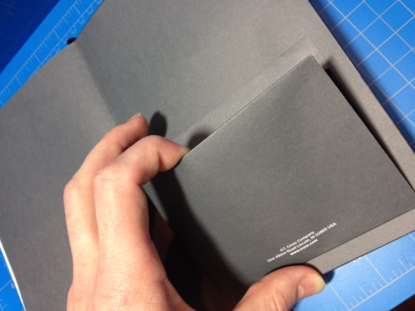
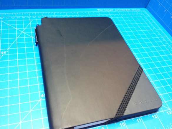
The cover of the book is a nice, smooth faux-leather, black save for a triangle on the lower right of the front where the color varies (mine’s blue). It covers the full 5.5” x 7” paper part of the book, with a ½” extra bit around the spine, which is hollow, creating a “tube” where pens can be stored (it also helpfully says “Cross Jotzone™” on the spine) . “Cross” is nicely but subtly stamped both on the back and the triangle in the corner. An elastic band is attached to the back in a novel way, so that when it is being used to hold the book closed it lines up with edge of the colored triangle. Inside there is nothing special behind the front cover, but inside the back is a small, simple cardboard and paper pocket. It is attached so it is accessed from the top, a decision that with its small size seems to have been made only to avoid comparisons with Moleskine.

photo-249

The paper is very good, a nice 100gsm (70lb) that is smooth, but not too smooth in my opinion (it certainly isn’t as smooth as the Clairefontaine paper fountain pen people love). It handles fountain pens and liquid roller balls quite well; with minimal feathering and show-through under normal usage conditions (I’ve done no test with flex pens or triple broads) and the dry time isn’t that bad, though far from instant. The pages themselves are nice and white with a ¼” grey ruling that stops before the page ends, and a stupid grey triangle in the corners right under where the triangle is on the cover. This area helpfully says “Cross Jotzone™” on every page, and it’s supposed to be where you put your quick summary notes or something so you can easily riffle through the pages and find what you’re looking for. I think this is dumb (and I hate pre-printed words on the pages of my notebooks) but nobody asked me and the paper is good enough that I could easily ignore that (and the ruling that is far too large for me).

photo-247

But now for the reason I haven’t used the book that much, and wouldn’t buy another one. I admit it’s quite petty but I use my notebooks a lot, and I want them to look good. That’s why I still use Moleskine classic hardbacks, it’s very hard to find a notebook that resists damage (page corners bending, cover denting/ripping/bending etc) better than those books. And this one is, cosmetically speaking (it feels easily strong enough to not fall apart structurally before being used up) is the worst I have encountered. After sitting for a day or two in my bag, with the only other items in the bag being non-spiral notebooks the cover became covered (no pun intended) with irreversible scratches and scrapes that are quite noticeable. Basically, if you want to maintain the “Cross” professional look, it’s a desk notebook, and I have reviewed it like a desk notebook. It’s a pretty good if gimmicky one, but I personally couldn’t stand to look at the satin faux-leather cover getting so beat up over time (and I wouldn’t recommend using the spine pen holder, as its made out of the same, easily damaged material). I feel like it wasn’t really thought out, and is more of an “executive gift” that no one is expected to really use, and that’s a shame because it comes with a great pen.

photo-248photo-250

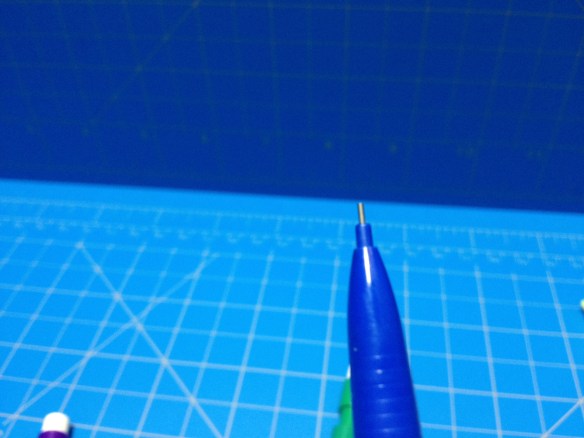
The pen is a very simple chromed metal pen (I would say steel from the weight, it’s quite heavy for a pen of its size) with a smooth cylindrical non-tapering barrel. There is pointed-ish cap finial at the back and a cone at the front leading to the point. It’s retractable, with a twist action, and there is a clear mark and band signifying where the pieces come together (and it is the smoothest action I have ever felt in a pen). The adornment and the clip are minimal, probably to be inexpensive, and while it’s a little ugly, the simplicity makes it easy to overlook. The cartridge is a short version of the standard Cross cartridge in a medium point. It, like most Cross pens, is very smooth, in this case especially when writing cursive. It does have some startup problems, especially when left unused for a time, but that problem can be solved by using it more or getting a new cartridge.

photo-245

In the end it’s an alright notebook, and a good pen. I wouldn’t purchase them for myself, but it does make a very nice looking gift, and it’s functional, with good paper and a nice writing pen. It’s a desk notebook, and a heavy desk pen (but I like the weight) made of good quality materials, but essentially with a disregard for useabilty. I can recommend them as desk materials, but not as daily users.

Review – Western Family Mechanical Pencils

If you are ever in dire need of a mechanical pencil, and somehow find yourself at a shop that doesn’t sell Paper:Mate Sharpwriters at the price of whatever change you have in your pocket, or even at all, the Western Family mechanical pencils may be a cheaper, and click-advanceable, alternative. But are they actually useable?

photo-234photo-236

The body of the pencils is very simple; a smooth cylinder for the barrel with a tapering and fluted (for grip) cone leading to a plastic nub (lead pipe) at the front (this part is free spinning but doesn’t appear to detach). At the back is a nothing-special click mechanism with an integrated plastic clip (that does indeed clip to things and hold it in place, but is pretty flimsy) and a small white eraser on the back. Removing the eraser (which actually fits down inside almost all of the click mechanism) reveals the inner lead-holding tube, which comes stocked with one extra lead per pencil. The entire click mechanism can also be removed for more direct access.

photo-235

The performance is nothing to write home about. The HB 7mm lead is, as one would expect, fairly soft but not too soft, and a bit wide for people like me (I prefer 5mm, but I can live with 7). The eraser does indeed erase: it gets rid of most regular graphite marks but can be used up very quickly. The barrel of the pencil feels sturdy, but the ends are flimsy and plastic-y with tolerances that aren’t very tight.

photo-237

Overall the package is fairly bare-bones, but functional. I wouldn’t use them as my main pencils, but they’d work in a pinch. For only a few dollars you get 10 pencils (in 5 terribly boring colors) with 2 leads each and a body and eraser that will hold up probably no longer than it takes to use those 2 leads (the clip being the weakest link there). There is nothing particularly appealing aesthetically about them and no information (like lead size) other than “Western Family” printed on them. They’ll work for scattering about for use if you can’t find your normal pencil or for loaning to people who don’t care about the pencil (like at the office, or playing D&D) but I can’t recommend them for any other reason.

Book Review – All the Knots You Need (By: R.S. Lee)

All the Knots You Need is a 1999 book by R.S. Lee about, surprisingly enough, knots. It is a fairly short and heavily illustrated guide to the knots most people would need in their “day to day” lives (quotes because I rarely need knots and I probably will only need a bowline and a square knot in my life) and it took me way longer to finish than it should have. But that’s not the point here; “did it teach me how to tie knots?” is the point.

file_230_8

The book has around 60 knots that it shows you how to tie, give or take 10 for similarities, like the knots being “the same” but in slightly different configurations, and how you want to count them as “individual knots”. Each one has between 1 and 4 illustrations associated with it, mostly on how to tie it, but sometimes with what it looks like tied. These illustrations are very simple, and clear, but do have more of a flair than just a line telling you what to do (they actually look like rope). They suffer from what all “how-to” books suffer from, they don’t quite explain exactly what to do in a 3-dimensional space. Even with the worded explanations provided I found myself having to try knots again and again with slight adjustments and reviews of the diagram. Since most of the images are singular they don’t provide the proper context for the “process” that is tying the knot, and even the multiple images convey motion very poorly. But that could also be a function of how “knot-illiterate” I am.

photo-228 photo-229

Included in the book along with these knot-tying instructions is information about materials, the parts of a rope, rope repair, rope care, and a glossary of terms related to ropes and knot-tying. All of this information is presented in easy-to-read and understand ways, with minimal but well-written (and drawn) text and diagrams. Almost everything is easy to understand (once you get the hang of it or are interested in an application) and nothing superfluous is added to inflate the book’s length. That being said, some of the sections were incredibly boring to a person (like me) who wouldn’t have a need for those knots on a regular basis (the fishing knot section comes to mind) and if one doesn’t closely follow the instructions it isn’t hard to get lost. But, as I said, I’m not one who needs many knots; the fishing, hoisting, farmwork, and sailing knots aren’t of particular use to me, and the sections aren’t “enthralling”.

For a newbie like me just starting to really learn knots (I didn’t retain much boy-scout knowledge) this is an unintimidating way to get started. The knots you really need are present and presented in a generally understandable format. It is worth mentioning that you pretty much need a rope or the described tying device (fishing line in some cases, or a frayed rope to whip and mend) to get the full effect. And reading this book is almost useless without a lot of practice during and afterwards. Knots aren’t just things that you throw in your brain and then can do perfectly. They need to be practiced in order to be effectively executed. But while the book can’t do that for you, I’d say it’s a good place to start.

Review – Art & Parcel (September 2016)

Art & Parcel is a monthly subscription service for art supplies from H. Blyth & Co. It’s like a Lootcrate, but for art supplies; so it’s way better than a Lootcrate (my opinion). But with so many of these monthly-blind-subscription-service things around, what makes this one special enough to look at? (Answer: Art supplies) And is it worth it to get one?

photo-217

(Couple of notes here: I got this parcel for free {and even though I got to pick one, I didn’t get the one I picked, so the picking part won’t influence the review} for review, and I live in the US where the “subscription” part of this service is unavailable. From what I can tell that means that I would have to pay up front as a lump sum to get my parcels, instead of being able to pay by the month, this also means that shipping cost is terrible to get them here, £16 (About $20) is a steal for these products, and the shipping in the UK is a great deal too, even throughout the rest of Europe it doesn’t exceed the price of the items like it does coming to the US)

photo-226

The one I am going to be looking at today is September’s parcel, which is focused mainly on colored pencils, but first I’ll talk quickly about the packaging. Mine was shipped in a bubble envelope, inside of which was a very nice cardboard box that was very well sealed with brown tape. On the top the Art & Parcel logo is printed very plainly, and on the bottom in pencil there is the month. (My box was a bit dented, but this is likely from the post office as, due to my schedule, the box had to be sent through the post twice) Inside is a nice packing slip that explains everything that is in the box along with its regular retail price (if that’s anything to go on you save a pound or two from buying the items individually in this set). All of the materials are neatly and securely wrapped in a newsprint/tracing paper that is sealed with a sticker of the Art & Parcel logo. It is all very well executed and nothing got damaged.

photo-220

The first items in this box were four Faber-Castell Polychromos pencils. I am no stranger to these pencils (they were the subject of one of my first {and not as well written} reviews), though I don’t have these particular colors: Naples Yellow, Light Phthalo Blue, Chrome Oxide Green Fiery (wonderful name that), and Red-Violet. I think the choice of colors is a bit strange, but they are definitely useful, and give a better representation of the pencils abilities than a plain RGB or RYB would have. There’s not much more to say there since they are some of the best colored pencils around. One thing I do really like about them is the fact that they layer so that some colors can somewhat be on top of other colors, unlike the cheaper colored pencils where they’re pretty mutually exclusive.

photo-225

Next is the KOH-I-NOOR Hardtmuth Magic pencil, which is basically a fat colored pencil that has a “lead” made up of the 3 RYB colors. This means that as you write or color with the pencil it changes, and the colors mix together to create a nice gradient effect. In practice the yellow mixing with both the red and blue works great, but the purple almost looks black and rarely shows up, and getting a nice solid version of one of the primary colors is very difficult, so the gradient looks more green and orange than anything else. I would bet that with some practice and odorless mineral spirits with a blending stick that it could produce wonderful effects, but I would still have trouble finding a use for it.

photo-224

Third up is another Faber-Castell product; one of their Pitt Artist Brush Pens, another item I’ve looked at in the past, though this is a different version. It’s a “big brush” and the body of the pen is over a half inch in diameter, a bit chunky for me but still very easy to hold on to and surprisingly comfortable. The color is “Cold Grey IV” which seems to be in the middle of the grey family, and the brush is very fat, going from lines of about ½mm to almost 5mm. It’s also got all of the stuff you want out of an ink: waterproof, lightfast, and archival quality. But I’m not really sold on how it fits with the rest of the stuff here. It is a grey, which makes it more like a pencil when sketching, but going over the same place multiple times does make it darker. It’s just strange to me, but then again I have a very different style to most people, and playing around with a new brush pen is always fun.

photo-222 photo-223

And the final item included is a 10-sheet pad of watercolor paper. It’s made by Fabriano but has the Art & Parcel logo again on the front. It’s A5 size, which is about 6” x 8” and is a hefty 300gsm. It handily took everything I threw at it without flinching, bleeding, or feathering. Sharpies, calligraphy pens, and brush pens push most papers to the limit, but this stuff is truly meant for paint (watercolor at least), which I don’t have too much of lying around (in accessible areas, I did have some tempera and it handled that very well), but it seems easily capable of handling it. A liberal application of water will turn it in to one big slight buckle, but that’s about it. My only complaint is that there are only 10 sheets.

photo-218photo-219photo-221

Overall I’m very satisfied with this box. It’s well worth the money and provides several products that work in tandem, allowing you to start creating right out of the package without having to look for more materials. From what I can tell, this is true of the previous parcels as well, but each one comes based in a different medium. The subscription would be relatively inexpensive way to try out something that might not be in your comfort zone without having to do a lot of research or spend time picking out and ordering products. It was honestly really hard for me to try and pick out a parcel I wanted. The recent ones at least were all super cool (and they can be purchased even after the subscription goes out, so nobody needs to miss out like with other sub boxes) and I’d be signing up right now if shipping to the US didn’t more than double the price (damn the postal service(s)). I really like this box. It’s given me a bunch of cool stuff to play around with (and a Haribo candy to eat*) and if the idea of getting a bunch of high quality art goodies in the mail every month appeals to you I would recommend it.

photo-227

*I ate it; it was good (like a softer laffy-taffy).