Review – Faber-Castell Grip 2020 Ballpoint

Sometimes the basic problems of a cheap ballpoint pen can just get to you. Many ballpoints have a round or hexagonal design that can lead to hand cramping or slipping while trying to write with thick, uncooperative ink. You see additions like silicone rubber grips occasionally as a remedy in the US, but apparently in places like Peru they have attempted to remedy these problems directly in the design of the pen. The Faber-Castell Grip 2020 boasts an ergonomic triangular design, with as studded grip and “smooth writing” ink. But how well does that improve performance?

The body is a simple, translucent, subtly triangular-ized cylinder with 150 small rounded “studs” for grip evenly positioned on the faces. The cap is round, with an integrated clip, and it has the relatively unique feature of sliding “under” the barrel rather than over it with the required step down being about the last quarter of the cap. Underneath the lip holding the cap in place there is a slightly tapered cone, friction fit over the ink tube; this cone can be removed, allowing the ink tube to be replaced. At the back there’s a stopper that steps down near the end, forming a space between it and the body where the cap can be posted. Over this stopper, on two sides of the triangle, there is written material: stamped in silver lettering is “Faber-Castell” and printed on a label is the barcode, model number, ink (and pen) color, and “Made in Peru”. I’m a bit disappointed by that, since, even though it’s on the back, labels on writing instruments have a tendency to get damaged and if that happened you wouldn’t know the model to get a replacement.

Functionality is quite good. The cap both caps and posts securely while maintaining the “lines” of the pen (the pen flares out ever so slightly in the back so it doesn’t match up as well there, leaving a step down instead of a {relatively} smooth transition). The clip is fine but isn’t very tight and it slips on thin material (its attachment point and the plastic it’s made of are surprisingly rock-solid, though). The ink is smooth as promised, coming out of a very medium tip (broader than I like, to be honest). For all intents and purposes it is the same as the other Faber-Castell made-in-Peru pens, maybe a little bit darker, and with blobbing being present, but not nearly as frequent as the other models I’ve looked at (counter-intuitively {usually wider tips on ballpoints leads to more blobbing}).

It’s a very nice little pen. For my personal daily use I prefer something shorter and with a finer tip, but this pen is comfortable, easy to hold, smooth writing, and doesn’t slip. I also really like the cap and how it doesn’t expand the circumference of the pen (save for the clip) and is probably less prone to crushing or cracking. If they managed to make the clip a little better, and offered the top in a fine I would seriously be looking to import some to use all the time. So if you’re looking for a simple, relatively inexpensive, comfortable, and durable (the plastic is very solid feeling) pen, and don’t mind importing, I’d certainly give this one a try.

Review – Faber-Castell Trilux 031 (Black, Blue, and Red)

Some time ago I reviewed the Faber-Castell Lux (034), an inexpensive Peruvian pen comparable to cheap Bics or Paper:Mates. They were pretty decent pens but they had small, round bodies that could easily become uncomfortable (I personally don’t have much of a problem with the size, but I can see how some people might not like it). Their bigger brothers, the Trilux (031 in this case), have larger, triangular bodies, in an attempt to remedy this problem and provide a more ergonomic experience while still being inexpensive. But are they actually more comfortable?

“Probably” is the answer. The body is a very rounded triangular shape (in green for the 031, the back of the package indicated different numbers are different color barrels) with a cylindrical cap in the back and the slightest of step-downs in the front third, followed by a quick tapering to a point. The step down and end cap are just for the single-piece cap-with-clip to be able to grip since it’s still round for some reason. Both the cap and end-cap (finial?) are color-coded to match the ink color of the pen. Printed/embossed in black on the side is enough information to identify the pen.

The section is comfortable to hold: the triangular shape fits well in the hand (with a standard 3-finger grip), the plastic is easy to hold, being slightly less polished after the step down, and said step down isn’t an issue at all, barely being noticeable. The cap is post-able (I only mention that because with the triangular shape and round cap they had to go out of their way to make that so) and the integrated clip does a fine job but I would suspect it’s easy to snap off.

The inks seem to be the same as those used in the Lux, which are fairly comparable to any other set of inexpensive ballpoint inks, with the red being on the darker rather than the lighter side, the blue being quite dark, and the black feeling warm and grey-ish. My set in particular is fine-tipped, and writes fairly smoothly, but with more blobs than I would like. When I first opened the package the red and blue pens worked while the black was dried up. Warm water and/or rubbing alcohol didn’t unclog it and I finally had to resort to using a lighter, which I wouldn’t recommend, but it did work and was likely the only way to get it to write as it is “non-disassemble-able” (unless you want to destructively disassemble it).

In the end they’re a solid pen, and a comfort upgrade with their thicker section and triangular design. They’re not the perfect office pen, but they feel well made (even if the plastic feels ever so slightly less flexible and/or solid when compared to some other similar pens), they write, they’re comfortable, and are inexpensive. I wouldn’t be seeking them out, and with them being “Producto Peruano”, finding a steady supply in the ‘States would be hard, but they are an increase in comfort to an already well-performing pen for the price.

Review – Cross Jotzone Notebook and Pen

Notebooks are quite handy things, but most of the common ones look a little unprofessional. If the standard spiral and composition books won’t work for you, and Moleskine just seems a little cliché, maybe Cross has the answer for you with its Jotzone series of notebooks.

photo-242

I feel I need to put a bit of a disclaimer here at the front. I usually carry a notebook around with me and try to get through about a quarter of the pages before I do a review on it (that’s why I’ve done so few notebook reviews: it takes time), but on this one I certainly didn’t get anywhere close to that, for reasons that will be explained in a moment.

photo-246

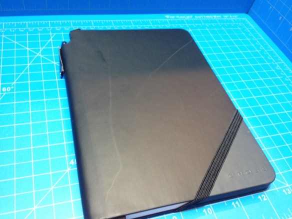
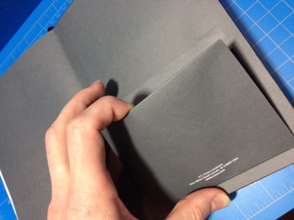
The cover of the book is a nice, smooth faux-leather, black save for a triangle on the lower right of the front where the color varies (mine’s blue). It covers the full 5.5” x 7” paper part of the book, with a ½” extra bit around the spine, which is hollow, creating a “tube” where pens can be stored (it also helpfully says “Cross Jotzone™” on the spine) . “Cross” is nicely but subtly stamped both on the back and the triangle in the corner. An elastic band is attached to the back in a novel way, so that when it is being used to hold the book closed it lines up with edge of the colored triangle. Inside there is nothing special behind the front cover, but inside the back is a small, simple cardboard and paper pocket. It is attached so it is accessed from the top, a decision that with its small size seems to have been made only to avoid comparisons with Moleskine.

photo-249

The paper is very good, a nice 100gsm (70lb) that is smooth, but not too smooth in my opinion (it certainly isn’t as smooth as the Clairefontaine paper fountain pen people love). It handles fountain pens and liquid roller balls quite well; with minimal feathering and show-through under normal usage conditions (I’ve done no test with flex pens or triple broads) and the dry time isn’t that bad, though far from instant. The pages themselves are nice and white with a ¼” grey ruling that stops before the page ends, and a stupid grey triangle in the corners right under where the triangle is on the cover. This area helpfully says “Cross Jotzone™” on every page, and it’s supposed to be where you put your quick summary notes or something so you can easily riffle through the pages and find what you’re looking for. I think this is dumb (and I hate pre-printed words on the pages of my notebooks) but nobody asked me and the paper is good enough that I could easily ignore that (and the ruling that is far too large for me).

photo-247

But now for the reason I haven’t used the book that much, and wouldn’t buy another one. I admit it’s quite petty but I use my notebooks a lot, and I want them to look good. That’s why I still use Moleskine classic hardbacks, it’s very hard to find a notebook that resists damage (page corners bending, cover denting/ripping/bending etc) better than those books. And this one is, cosmetically speaking (it feels easily strong enough to not fall apart structurally before being used up) is the worst I have encountered. After sitting for a day or two in my bag, with the only other items in the bag being non-spiral notebooks the cover became covered (no pun intended) with irreversible scratches and scrapes that are quite noticeable. Basically, if you want to maintain the “Cross” professional look, it’s a desk notebook, and I have reviewed it like a desk notebook. It’s a pretty good if gimmicky one, but I personally couldn’t stand to look at the satin faux-leather cover getting so beat up over time (and I wouldn’t recommend using the spine pen holder, as its made out of the same, easily damaged material). I feel like it wasn’t really thought out, and is more of an “executive gift” that no one is expected to really use, and that’s a shame because it comes with a great pen.

photo-248photo-250

The pen is a very simple chromed metal pen (I would say steel from the weight, it’s quite heavy for a pen of its size) with a smooth cylindrical non-tapering barrel. There is pointed-ish cap finial at the back and a cone at the front leading to the point. It’s retractable, with a twist action, and there is a clear mark and band signifying where the pieces come together (and it is the smoothest action I have ever felt in a pen). The adornment and the clip are minimal, probably to be inexpensive, and while it’s a little ugly, the simplicity makes it easy to overlook. The cartridge is a short version of the standard Cross cartridge in a medium point. It, like most Cross pens, is very smooth, in this case especially when writing cursive. It does have some startup problems, especially when left unused for a time, but that problem can be solved by using it more or getting a new cartridge.

photo-245

In the end it’s an alright notebook, and a good pen. I wouldn’t purchase them for myself, but it does make a very nice looking gift, and it’s functional, with good paper and a nice writing pen. It’s a desk notebook, and a heavy desk pen (but I like the weight) made of good quality materials, but essentially with a disregard for useabilty. I can recommend them as desk materials, but not as daily users.

Review – Faber-Castell 033 Ballpoint Pen

I recently received a box of things my brother got for me on his trip to Peru. Inside were several pens that seemed to be commonly available there. Indeed, they are more common there than in the US, because all of the information I could find on them was in Spanish, or Russian (Ukrainian? Cyrillic of some sort). And they do say “Product of Peru” in Spanish. So let’s get to it and look at the first type I received, the Faber-Castell 033 ballpoint in black.

photo-156

The pen has a very classic octagonal design, and it’s made with a plastic that feels much like the plastic that older pens and mechanical pencils were made out of, except it is much lighter and feels more brittle and thinner as a result. The faceted barrel is capped on the back by a step-down plug of a light grey color that allows the pen to be neatly posted, and the cap on the front is a very simple, if unsightly, ribbed design. The clip is molded in and works, but is quite filmsy, and I wouldn’t trust it. The cap does fit securely over the section, which is a simple taper in the barrel to a larger-than-normal metal cone, at the end of which is the ball. As far as I can tell, this tip is not removable, and thus the pen is not refillable. Stamped in gold on the side is just enough information to identify it, but not much more.

photo-157

Writing is surprisingly smooth for a ballpoint, but it does have occasional startup issues and more blobbing than I can get past. The ink is comparable to inexpensive Bic ink. It’s suitably dark and black, but it’s got a bit of a red sheen, and upon close inspection under a bright light it looks like a very dark purple. It’s still on the warmer side of things, though. It dries fast (except for the blobs), but with certain types of paper I wouldn’t try it left-handed. And its blobbing might cause it to smear for left-handers anyway. It is suitably waterproof like most ballpoint inks. I haven’t tested lightfastness, but in general even cheap black inks do well, but it isn’t archival quality.

Overall it’s a well-working, inexpensive pen. As far as super cheap pens go it isn’t the best, but it’s far from the worst. It writes well, but not perfectly. The body is simple with no frills and holds together despite being cheaply made. And there isn’t much more to it than that. I wouldn’t be going out to import them, but I would (and will) use them if I ended up with them (which I obviously did).

Review – Uni-ball Jetstream Bold

Some people search for the best of something. I never really looked at my collecting in that way. I just like using a variety of things, and for me I know that there’s no one perfect thing. But that doesn’t stop me from liking sites like TheWireCutter.com, which finds the best product in a given category for the average consumer. I was recently featured in their article about the best mechanical pencil (along with several other, well-known reviewers), and while I was talking to them, I thought I’d try out their recommendation for best ballpoint pen: the Uni-Ball Jetstream. If you read their mechanical pencil article, and my review of their pick the Uni Kuru Toga, this might seem familiar. I do understand why people like the pen, but I don’t like it so much, and here’s what I think of it.

20150311-220545

My particular Jetstream is the bold 1.0, and starting at the top it has a nice, beefy, chrome click button that is very satisfying to use. Down from that is the logo, size, and a solid clip that does its job. The majority of the barrel is rubberized, with the Jetstream logo in the top half in a hard-to-read, reflective plastic. There are slight divots on the section for grip, which actually flares out, instead of tapering in, making it quite large in the hand, and then an interesting-looking chrome cone that leads to the point. This cone does screw off and the pen is easily refillable.

20150311-220550

The ink itself is a nice, cool black that slides onto the page easily. There is an ever-so-slight amount of dry time, after which the ink is quite waterproof. While the ball does roll nicely and the ink flows smoothly, I still get blobs and stuttering, blobs being less frequent than with comparable pens, and stuttering much more frequent. This slight stuttering is hardly noticeable when writing, but is virtually the only feedback the pen gives. It is most definitely the smoothest ballpoint I’ve ever written with but I don’t feel like I’m in control of it when I’m writing. The stuttering is easy enough to overlook when the writing is done, though.

Overall it’s a well-designed, sturdy pen that I don’t want to write with. The point slides out from under me, and the thick grip cramps my hand after a while. It’s also extremely light, which makes me want to hold it tighter so as to not lose it. Still, the fit and finish are great, it’s very satisfying to hold, and if you want an “inexpensive” smooth ballpoint, it really can’t be beaten