Review – Pink, Orange, Turquoise, Burgundy, and Lime

And now for five more Pilot G2 colors! These are the the more “regular” colors, but just a bit different, so let’s go.

pilot pen comparison

The first is pink, which is very pink. It’s probably the brightest and most visible color in the set, though it fortunately isn’t an eye-searing hot-pink. It runs fairly thick and as pinks go, is quite deep, closer to red than to rose.

The second is orange, which is fairly bright, the second hardest to read of the bunch. It is plainly orange though, and will be a stark contrast to any other color in the set. Like most of the other colors, though, it is done well, and is not painful to look at or too difficult to read.

Next we have turquoise, which is a greenish-blue color. Honestly, it just looks like turquoise, which is a very pleasant color. It’s appealing and subdued, it almost looks like sky or clear “caribbean” sea. It’s a fantastic color, especially if you want a bluish color, but a bit lighter and happier.

Fourth is burgundy, which is a deep, purplish red. It’s almost like a red-black. It is very readable on the page, but gives writing a bit of flair not seen in a red, black, or purple ink that would be close. The ink is a bit thick though, and has some starting problems, but that just means it should be used more often.

And lastly for this set is lime, which is obviously a very light green. It actually looks nothing like a lime (like most colors called lime). It is the hardest to read of the bunch, but still isn’t quite offensive to the eye, though I wouldn’t write with it. I think it’s still the worst here, though, as it doesn’t match the nice qualities of the rest of these inks, and it’s a bit dry on the page.

Next up are the more uncommon colors.

Speak Your Mind 157 #781-785

QUESTIONS

1. What is your school mascot?

2. Do you like to shop for clothes?

3. How often do you think girls should wear dresses?

4. Is you locker neat?

5. Why do you think good fairies are almost always female?

ANSWERS By: Austin Smith

1. When I was in school the mascot was a buck.

2. I don’t dislike it, but I’m not excited about it either.

3. I don’t like dresses, so I think never.

4. It was when I was in school.

5. Because as a species we associate women with birth, and caring, and such, which are generally considered good traits.

Speak Your Mind 156 #776-780

QUESTIONS

1. Why do you think some people can sing better than other people?

2. Which kind of breakfast cereal do you like best?

3. Do you own a brown sweater?

4. In what way do you think people are like bunnies?

5. Would you rather write on your own paper or in a workbook?

ANSWERS By: Austin Smith

1. Because everyone is different.

2. Honey bunches of oats.

3. I don’t own a single sweater.

4. We are both mammals.

5. When I was in school I wouldn’t have cared but now I’d want to use my own paper.

2014 Site Update – Stuff For the New year!

Yeah! It’s 2014! And that means… it’s 2014. Well for me, that means some changes. Some are good, and some are… well “I” think they’re all good, because they make things better for me, but some might cause some inconvenience for your viewing, for which I apologize.

But to start with the good, I’m going to be doing a new comic! Yes, that means there will be 13 a week for all tastes, and some extras here and there. The new strip will be called 万年筆(man’nen’hitu): The 10,000 year brush. It will be about fountain pens, which I admit is a niche market, but no other strip will be removed or paired down to accommodate it. This is a straight-up addition.  Also, I will be working on a comic in a large format that will be more serious, but less frequent. And don’t let the seriousness fool you, it’ll still be a lot of laughs hopefully, but no dates yet. (万年筆 Starts this friday)

Back in November I released five new books in the fifth wave of my collections. Most of them are available at the Antelope Lodge in Alpine, while a few are also available in other spots in the area. But for those of you who are not near me I also launched an online store, where you can buy my books and a few other goodies. I recommend checking it out, but of course I would.

Speaking of updates to the site, I had to move all of my video content over from Blip.tv to Youtube, I have a blog post explaining this, but it means I’m going to start placing ads on previously ads-free videos.  That shouldn’t be much of a big deal with the way most online videos work now. But I will make sure that the video is at least a certain length (6 minutes or more?) before placing any ads, so as not to waste too much time. Also, I am now going to be placing (relatively few) ads on the site. You can see one in the sidebar already, and I will be putting more out to see where they are the least intrusive over the coming months. I hope you understand that I do need to pay for this site eventually somehow, and right now I’m not cutting it.

Ads might also be going up on the next place I’m going to mention, The Dragon Funnies, which I upgraded to a full site this year, but right now I need to get them up andy working. As for my content on the site, the new comic won’t be added, and some of the other comics might be removed as well, but this does not mean the site is going away. For every comic I take off I will be looking into putting comics from other talented cartoonists up. I want the site to end up like the newspaper comic section I would make, and so I intend to find the best content possible for it. It is also possible to submit a comic for the site, though if I don’t have any personal contact with you at the moment the most I can offer is exposure, which isn’t the best thing to offer right now, so, yeah. I will be working on a better way to get new comics up on the site while properly compensating their creators.

Also, come this new year I will be attempting to use more social media, posting as much content as I can on Twitter and Facebook, so if you feel the subscribe system on the site is a bit clunky, then you can follow there and get the highlights.

Now for the only bad news. Due to the high volume of content I produce, I have already stopped posting on redundant sites like the individual blogs for each of my comics. And at the end of January I will be ceasing posts on the Dragon Company wordpress site and Art Supply Critic WordPress site. All of that content is already posted on my main site, so nothing is going away, I’m just making it less of a hassle for me to post the content, and like I said, links will be posted in social media if you don’t want to subscribe.

All in all, I hope 2014 will be a good year, and it looks like it will be, so I hope to see you all there, and I hope y’all have a great time.

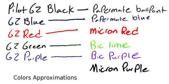
 

Review – Pilot G2 Colors – Black, Blue, Red, Green, and Purple

I don’t believe I have talked about G2 Pilot gel-pens before, I will do a full review later, but first I want to talk about most of the different colors that they come in. I have collected 15, and will split them into three groups, the first of which is the “normal” colors of black, blue, red, green, and purple.

ink tests

Starting with the black: it’s black, there is literally nothing special about it. It is a bit of a warm black, and it goes on smooth. It doesn’t have any magnificent qualities, it is just an all-around black.

Now for the blue, which is a fairly dark but basically standard blue, very similar to the black. It is probably one of the darkest standard blue pens available, and it is a fairly cool blue, like a deep lake. Again, though, it has nothing particularly special to offer.

The red is a medium red, which is a bit different. Most companies go for either an eye-bleedingly light red, or a deep red that is much more pleasant. As far as reds go this is in the middle, but it certainly isn’t neutral. It has no tint of pink, and is most definitively, starkly, red.

The green is surprisingly dark for a standard green. It’s almost a grassy color, and not the light, lime-ish color most other companies associate with green (it’s like the cherry flavor of pens). It is definitely green, but is unoffensive and pleasant. It sticks out, though, making it seem like one of those “replace red because it hurts people’s feelings on grades” pens (I’m no psychologist, so I know nothing about whether that is good or bad, it’s just what I thought of). I think it’s nice.

And finally the purple, which is the black sheep of the normal colors. It is a light, almost violet or deep rose color. It is warm and goes on a bit less smoothly than the other colors here. I really don’t like it, it’s just far too light, and it doesn’t go with the deep other colors at all. It really won’t stick out on a paper either, so it’s just kind of there, it has no natural color akin to it, so it has limited art utility as well.

Overall these are a very good set of office colors, and if you’re just looking for some smooth-writing different colors that aren’t too wacky, I’d look here first. But they do all have limited art potential, so you may want to delve further to get just the right color in that case.