Review – Up&Up Double-Sided Tape

Well, you can call me out of ideas again (but not Shirley). I’m going to be looking at tape. This time it’s the type of tape you never realize how much you need until you get some, and that’s double-sided tape. Specifically, from the brand Up&Up.

20141203-000355

The container is nothing special, it’s thin and plastic-y, but still flexible. The teeth are solid, and do a good job of cutting the tape. Everything is cheap but everything works on it. The tape can also be taken out and used in a different dispenser, though it is slightly thinner than regular Scotch tape and one must be careful to have it not stick to the inside of the dispenser.

The tape itself is good. The sides both stick strongly, and equally so. The tape itself is stronger than the adhesive, so it will come off before breaking. It is fairly pliable but it loses its adherence fast, so nothing that moves a lot, or will be handled, will be stuck for very long with the stuff. But really it’s for posters and scrapbooking, and for that it works superbly. It is quite transparent, but that only really matters if the things you’ll be sticking on both sides are transparent as well.

In the end, it’s good tape. It might be slightly below Scotch tape (in my opinion), but really not enough to tell. For any of its main uses it will serve well, and double-stick tape is really useful.
Review – Scotch Transparent Tape

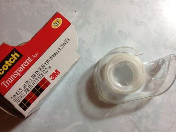
If reviewing Scotch Tape means I’m out of ideas, then call me out of ideas (I do have plenty more things to look at, though). But really, who doesn’t have a use for tape? And when buying that tape, couldn’t shaving off several pennies save quite a bit of money over time? Is the brand name really worth it (It’s pretty generic-sounding, now, isn’t it)? Let’s see.

20141111-234203

First thing, the container: Scotch Tape comes with a clear plastic, simple, but quite durable dispenser. The roll of tape is clicked into place on the wheel and at the front are several teeth for separating the tape into strips. Is any of this the best quality? No, but it gets the job done, and very cheaply. If one has a tape dispenser that they like, individual rolls can be bought, so I’d say that this works quite well.

Now onto the tape itself, which certainly isn’t “magic” or “invisible”. The stuff I’m looking at is just labeled “transparent”, and that it is. The tape is easy to see through and sufficiently sticky that it will hold most documents together without a problem in either holding or reading. In fact, the tape itself is very strong, and the adhesive is more likely to break than the tape itself (or perhaps what it’s taped to). Given that it does have a certain rigidness to it, though, it isn’t a tape for repairing any item that, like a tool, will be used, or will move. It is surprisingly strong, but really only good for paper products.

Now, is it worth it to buy Scotch Tape and not some other tape? Given how inexpensive Scotch Tape is already, I’d say yes. And if it isn’t right where you’re shopping, I’d even hunt around for it. The two rolls that come in a pack for around a dollar will last for quite some time. And I’ve seen other brands for around the same price that cease to be sticky once they came off the roll. In short, there’s a reason we say “Scotch Tape” and not “transparent adhesive tape”.

Review – Papermate Mirado Black Warrior

There are a lot of pencils out there, and it seems there are even more cheap pencils (that isn’t possible, I realize, but it made sense when I was typing it). How good can some of these pencils be? Today I’ll be taking a look at the Paper:mate Mirado Black Warrior Pencil.

20141105-010555

The pencil body is simple and round, which is surprisingly not a standard pencil shape. I always had round pencils at school (a set of leftovers from my father), and people always liked the way they felt when I loaned them out (which is why I lost so many). The shape is quite comfortable, and just that little bit better than a hexagonal pencil. The set of pencils that I received have a satiny finish that make them fairly grippy even with sweaty hands (from what I understand, they used to be more shiny and slippery). The rest of the body is a plain black with “Mirado Black Warrior” in gold on it in a poorly chosen font, as well as HB 2 and the Papermate logo, the hearts of which take away from the “warrior”-ness.

20141105-010601

The back of the pencil has a standard pink eraser, which does its job and hasn’t dried out in the time I’ve had it. I’d guess it isn’t the best quality and if you always want to erase what you wrote I’d recommend getting a dedicated eraser, but these work fine for most of us. The lead is HB, but feels much softer than most HBs I’ve used. Perhaps that is just me, but I’d say it is at least a little softer and it covers smoothly and well. A good pencil for filling in scantrons or shadows. Because it is so soft it is not too great at holding a point, though.
Is it a good pencil? Definitely, and for the money it’s really just a matter of preference.

There are loads of good pencils in this price range, so if one that is round (make sure your desk isn’t slanted) and has a slightly softer lead sounds good to you; or maybe you just like the “stealth” idea of an all-black pencil, this one is at least worth looking at. And like I said, for the price almost anyone could afford to pick up a box to compare to any other pencil they happen to be using.

Review – Zebra Sarasa Colors – Hunter, Fuchsia, Cobalt, Light Green, and Violet

After the first five colors in the ten-color pack of Zebra Sarasa pens, the colors get a bit less conventional and a bit more extreme. Let’s look at the Zebra colors Hunter, Fuchsia, Cobalt, Light Green, and Violet.

zebra sarasa colors 2

First Hunter, which is a dark bluish-green, a bit more blue than usual hunter greens, which seem a bit warmer. The color is very deep, and in some places could easily be work-friendly. It is a very natural color and could easily fit an artist’s needs for a deep green. It lifts the most when exposed to water, but like the rest of the colors here, it doesn’t really budge to smear once it dries.

Next Fuchsia, which I’d call rose, but that’s just me. It sits on the fence for me between a deep pink and a light purple. I can’t really tell which it is. As far as either one goes, though, it is a very appealing color that, unlike other pinks or light purples, doesn’t hurt the eyes. It’s more of a flower color than anything else.

Third is Cobalt, which is a very grey blue, though I’m almost tempted to say it’s the other way around. It’s a dark and dim color that gives off a wintery feeling. Artists could find a use for it in many winter themes and its color is just subdued enough that it would likely be a good office companion and still let you stick out.

Fourth Light Green, which is almost lime. It hurts the eyes a little, but it isn’t terrible. I’ve certainly seen worse. It doesn’t look very natural, and it’s slightly hard to read. It might make a good color for marking mistakes, but otherwise its uses are limited.

And finally, Violet, which is bright and indisputably purple. It’s a flowery purple and that’s the only really natural parallel that I can think of. It also might not be work-appropriate because of its brightness. But it is superb in readability, not dark enough to blend in in low light, and not light enough to disappear on the paper. For casual writing, this one would be a keeper.

And that’s it for the ten pack of Zebra Sarasa Gel pens, I think they’re great little things, with an interesting color set in which some aren’t often seen, let alone this common. They’re nice inks, and I’d go for them if you like the pen.

Review – Zebra Sarasa Colors Black, Blue, Red, Navy, Mahogany

I’ve talked about the Zebra Sarasa before, and it’s an alright gel pen. The saving grace of many gel pens is that most come in a variety of colors at least partially unique to them, and the Sarasa is no exception there. Let’s take a look at a few of the colors.

The colors are always a bit off in the digital space

The colors are always a bit off in the digital space

First, Black. It’s a cool black that covers well. It works in an office setting and generally doesn’t get lighter even with minimal pressure. I’d say it’s black almost as soon as it gets on the page. The drying time is moderate and it’s water smudge-able.

Next, Blue.  The blue is quite dark, darker than most office-type blue colors. This makes it easier to read and more professional. It’s also natural looking, more like a deep sea-blue than an in-between blue that doesn’t really exist in nature. It’s the least smudge-prone of the bunch, but that won’t entirely stop it from lifting off the page.

Third, Red. It is a bland red, with no real pop to it. Though it is brighter than some of the competition, it isn’t really eye hurting. It’s quite noticeable and quite red but has no character — and no real flaws, either. It’s the color that fades the most when exposed to water.

Now, Navy.  Navy is a very deep, dark blue. It’s really almost black. You’d need a good light on to tell which one is which, though you could tell that black and navy are different colors with minimal light. It’s a wonderful dark color that is almost soothing and quite free flowing.

Finally (for this set), Mahogany.  It is really more like maroon. It’s a slightly purplish red which is also very dark and quite nice. It is much more noticeable than the navy, and still quite natural, giving an almost brown appearance from far away. It’s probably my favorite of the five, though the one with the fewest applications, and while you might get away with it at the office, it could be a hard sell. Unless you work for Texas A&M University.

That’s the five colors for this week. Next time I’ll be looking at the other five colors in the standard ten color pack.