Review – Moleskine Pocket Softcover Notebook

I’ve already reviewed the Moleskine pocket notebook in hardback, but I’ve also used the softback version, and since there are a few key differences besides the obvious, I though I’d highlight them. So this is only half a review, if you want to know about the paper you can look up my other Moleskine pocket review.

20131030-010203

So the cover is obviously soft. It is a lot thinner and as such you can see the binding through it, especially on the back where you can see the attachment points for the elastic band. They are a bit intrusive and noticeable. The cover is blank aside from the name Moleskine stamped rather deeply into the back cover. The look is a bit like the regular Moleskine, but the pages are cut the the same length as the cover, and it looks a bit more shiny. The front cover can roll up on itself and then bounce back, but it never fully regains its former shape. The back is much less flexible due to the back pocket that comes Moleskine standard. The cover also feels almost moist and rubbery, and any minor scratches and such simply bounce out unlike the Rhodia Webnotebook. The softness does mean that the elastic band leaves very noticeable marks on the cover and sometimes the paper. The spine in contrast to the hardcover feels much more durable and able to stand up to long, continued use.

20131030-010210

Which style of cover is better is a decision you have to make. This one is flexible, easily fits in a pocket, and is harder the permanently damage than the hard cover, but it offers less page protection and stability for writing, so it’s give and take.

Review – Layflat Dot Grid Composition

Sometimes lines don’t look right on drawings and grids are too intrusive. Dots can be easier to draw around and can give the general guidance that is necessary. If you want the added bonus of having a book that lays flat on your table or lap you might want to try out the Layflat Sketchbook Dot Grid Composition notebook.

20131023-014028

The cover has a static looking black and white style and and a black spine. There is a space to write a name and subject as well. The cover is very thin cardboard, the inside being plain white with a plastic coating on the outside. It is rather thin, and has a problem with the pointy corners getting dinged up easily. The spine does lay flat with a little prodding, though not as flat as a saddle-stitched binding, but flatter than any other types of composition books, and most other note books.

20131023-014034

The pages are thin as well, white with tiny grey dots at regular intervals. There are quite a few of the dots on a single page, though I don’t know how many. The paper shows through with almost every ink, though it does take a heavy amount to bleed through. Even a few fountain pens work. The corners get dinged up like the cover, and the individual pages are a lot easier to damage. The grid they form is easier to write with than many others and is fairly straight. Though many of the pages are not printed the same, so the dots are inconsistent. Each dot is made of several small dots so they are un-intrusive.

Overall it’s a good notebook for designs and sketches requiring general guidance. It doesn’t work well with larger fountain or brush pens, or heavier liquid ink pens. It can get dinged up easily, but it does lay flat. In the end it is a cheap and nice notebook. Though it has faults, it is reliable and of good quality. It’s good for students or casual designers.

Mini Composition Showdown

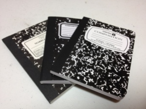
A while back I reviewed the Dolgen Inspira mini composition book. I have quite a few books like this and instead of reviewing them all I decided to just compare them all together. So here’s the mini composition showdown. Mead vs. Inspira vs. Top Flight.

First off, covers and binding. All the covers are the standard composition marble pattern, with the Inspira being the most crowded followed by the Mead and then the Top Flight. The binding on the Top Flight is a sturdy fold stitch with eight signatures, while the Mead and Inspira are weak, simple glue binding. All notebooks lie flay fairly well, though the Top Flight takes more breaking in. Cover durability again goes to the Top Flight with the other two tied. The cover corners are straight on some of the Mead, clipped on the Top Flight, and rounded on the Inspira, meaning the Mead with the square corners will most likely tear up quickest. Other Mead notebooks have rounded corners.  If you want color the Mead and the Top Flight are the way to go.

20130614-235313.jpg

Their dimensions are about the same, with Inspira being slightly taller and Mead being slightly wider. The Mead and Top Flight both have eighty pages, while the thinner Inspira has sixty. The smoothest paper belongs to the Mead, the roughest to the Inspira, and the Top Flight is very akin to newsprint, unfortunately, not very high quality. All are not archival quality paper and fade rather quickly on the shelf, though they are bright white out of the package. None are very good at holding ink, but the Inspira is best without bleeding, followed by Mead and Top Flight.

What will really make or break these books, though, is their large price difference. The Inspira are three for one dollar (U.S.) the Top Flight are five for three dollars, and the Mead are one to two apiece.

So if you can organize all that and determine the best for you you’ll end up with a very nice pocket book. Each one is suited subtly to a different task so the main challenge is finding out what is best for you. They are certainly not the best memo books by any means, but they’ll certainly work, especially in a pinch.

Review – Bienfang NoteSketch Book

One of the worst things about different types of notebooks is that they vary in the page setup. Some have lines, some graphs, others are blank. Even the lined ones vary in the ruling between the lines. And what if you want to make a note on a sketch? Sure, you can just write it somewhere on the page, but it never really looks right, does it? Likewise with drawing on lined paper. Or what if you want to draw a diagram with a description. It will never go in any space you have left on the page, especially if it’s a long one.

20121007-000204.jpg

Well, Bienfang appears to have those people covered with the NoteSketch Book (all in different fonts so you remember it better). But we have to start with the covers first. The front cover is a nice card stock, heavy and not likely to rip out. It can take a mild beating, regular use is easily handled, but abuse isn’t. The back is cardboard and quite nice. It is light but strong, and will support drawing on ones lap or holding it in front of a subject. The paper inside is a little over half blank with the rest being roughly college ruled lines. It’s nice, but as thin as printer paper. It will only take pencil or technical pens before bleeding and wrinkling. Of course, for its intended use this is no problem. This also helps keep the book slim and it easily fits into most bags. They come in a variety of page sizes but those are all virtually identical, with the page size you like being the only deciding factor.

20121007-000211.jpg

Personally I can’t go anywhere without one of these. I don’t use them much at home, but on the road or just outside they are perfect. I don’t know about anyone else, but I only bring a pencil and a pen when I’m out, so any drawbacks from thin paper are negligible. And the ability to write notes and have space for it fits what I do. I love having a set aside space to put my thoughts or the story behind a drawing. If thats what you like to do, or you like to draft or draw diagrams that require explanation, this is the book for you. If thats not your thing, then this may just not interest you.