Review – Pilot P-500 Rollerball Pen

When I was a kid I loved the stationery section, and office supply stores were like candy stores to me. One day at one of these stores (Office Depot?) my parents bought me a pack of pilot P-700s which I loved and used for almost all of middle school and some of high school until they all got lost or dried up. I liked them so much I only did personal work with them and not any regular school work. Recently I found a P-500 (one size smaller) in a store and decided to see of they were really as good as I remembered.

20140326-015133

The cap of the pen is clear, with a little black bit in the top.There is a visible small black bit inside to keep it dry. The clip is metal and very tight, it’s got a ball on the end and very easy to slip into a pocket. It has a 0.5 printed on it to denote the size. The barrel has all necessary information printed on it (extra fine). There is a granite texture covering it with a clear end ball. The grip section is ribbed and very grippy for how slick the plastic is. There is a gradual slope to a very thin metal rollerball point. The section is clear making the ink supply visible.

20140326-015140

The line is an extra fine (0.5mm I’m guessing) and is advertised as being precise, which I have a hard time believing with any gel ink pen. Maybe it’s just my hand, but when writing or drawing with a gel or liquid ink pen everything just slides all over the place. This pen is no exception, though I will say that it puts ink where you tell it to put ink and nowhere else, and does it very consistently.

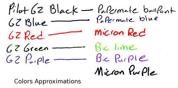
The inks color is black, almost the same as the pilot G2 black but a little warmer and a little lighter. It is a very good black for almost all writing and drawing purposes. It doesn’t cover well, but who uses an extra fine pen to cover anyway? The ink is very consistent and really nothing special in any of its properties otherwise. It flows as well or better than one would expect from a  pen of this price-point.

Overall, these are great pens, both for writing and drawing, but they are not technical pens and cannot replace them for a finished product. They are comfortable to hold and smooth writing. Just better enough than other pens to justify their price. They are a good in-between or starting pen, but not to be used for a finished product.


Review – Sheaffer Calligraphy Maxi Kit Part 3 – Ink – Blue, Black, Purple, and Turquoise

Now onto the Sheaffer inks in the Sheaffer Calligraphy set, which I will do in batches as I get around to trying them out. I’ll be starting off with black, purple, blue, and turquoise.

Surprisingly Accurate Photo

Surprisingly Accurate Photo

First black, which is a plain black, really there is nothing special. It’s a cool black that is very dark, but is not as saturated as one would want a black to be most of the time. For calligraphy and drawing it is good for the most part (being non-waterproof) but I wouldn’t go painting a picture with it.

Second purple, a color that has no place in a calligraphy set (something that can be said about every color that isn’t black, in my opinion). The purple is a nice deep purple with lots of shading in wider lines, though the shading doesn’t offer a great amount of variation. I personally wouldn’t use this for calligraphy and would have a hard time finding a use for it. But it is very pleasant.

The blue, Sheaffer blue, like all pen maker blues is very simple: a dark blue without much shading that does well with writing and okay with calligraphy. It is a fairly standard blue, non-waterproof and it almost looks like a ballpoint pen. Like I said, though, it is a bit darker than some others, so you might want to look into it if you want a darker blue.

Finally turquoise, which again I don’t understand being in this set. It is a very bright, nice color. It has some shading (which I’m not too fond of) but overall is fairly bland. A nice sky or Caribbean sea color, but not one for calligraphy but for daily writing in my opinion. You wouldn’t want to color a turquoise rock with it either.

That’s it for this time, It may take a few weeks, but I’ll look at the rest of the colors sometime in the future.

Review – Papermate Inkjoy Black, Red, Blue, and Purple

In my tradition (now) of taking a look at the uses of standard office supplies in art, I’ll be looking at the Papermate Inkjoy pens and their different colors. Today will be the standard colors of black, red, blue, and purple.

Not Entirely Representative

Not Entirely Representative

Papermate tends to make standard colors, and their black is no exception. One of the deeper Papermate blacks, the Inkjoy black is nice and constant, though is a bit blue-greyish. Not quite black, but very good for a ballpoint pen.

The red is also fairly standard. It’s light, but not light enough to say it’s pinkish. It is very subdued and pleasant, not as aggressive as most reds, making it a bit more natural.

The blue is very deep, but not very saturated. In low light it still looks blue, but one wouldn’t mistake it for a sky blue. Again, like the red, the low saturation makes it look less aggressive than some other hues. It’s got a very nice, watery feel to it.

And finally the purple, which again is deep but not saturated. It is unmistakably purple but not very aggressive. Unlike the others, though, this leads to a less natural look as most natural purples are deep and aggressive or light and flowery. This one is in between, which means it would be at home on your papers but not in artwork.

Overall, Papermate did a good job with these colors for the workplace. They definitely weren’t designed for art, though they could be worked in. Not superb but good enough. We’ll see what the next four have in store.

Review – Pilot G2 Colors – Black, Blue, Red, Green, and Purple

I don’t believe I have talked about G2 Pilot gel-pens before, I will do a full review later, but first I want to talk about most of the different colors that they come in. I have collected 15, and will split them into three groups, the first of which is the “normal” colors of black, blue, red, green, and purple.

ink tests

Starting with the black: it’s black, there is literally nothing special about it. It is a bit of a warm black, and it goes on smooth. It doesn’t have any magnificent qualities, it is just an all-around black.

Now for the blue, which is a fairly dark but basically standard blue, very similar to the black. It is probably one of the darkest standard blue pens available, and it is a fairly cool blue, like a deep lake. Again, though, it has nothing particularly special to offer.

The red is a medium red, which is a bit different. Most companies go for either an eye-bleedingly light red, or a deep red that is much more pleasant. As far as reds go this is in the middle, but it certainly isn’t neutral. It has no tint of pink, and is most definitively, starkly, red.

The green is surprisingly dark for a standard green. It’s almost a grassy color, and not the light, lime-ish color most other companies associate with green (it’s like the cherry flavor of pens). It is definitely green, but is unoffensive and pleasant. It sticks out, though, making it seem like one of those “replace red because it hurts people’s feelings on grades” pens (I’m no psychologist, so I know nothing about whether that is good or bad, it’s just what I thought of). I think it’s nice.

And finally the purple, which is the black sheep of the normal colors. It is a light, almost violet or deep rose color. It is warm and goes on a bit less smoothly than the other colors here. I really don’t like it, it’s just far too light, and it doesn’t go with the deep other colors at all. It really won’t stick out on a paper either, so it’s just kind of there, it has no natural color akin to it, so it has limited art utility as well.

Overall these are a very good set of office colors, and if you’re just looking for some smooth-writing different colors that aren’t too wacky, I’d look here first. But they do all have limited art potential, so you may want to delve further to get just the right color in that case.