Review – Flex By Filofax Pocket

This review has been a long time coming. I first picked up the Flex by FiloFax pocket book a year ago from a surplus store as they were being discontinued in America (though I can find them on Amazon again now). I’ve never really been the organizer type and I didn’t know what I would use the item for, but it was cheap, and black goes with anything so I picked it up. How could I resist another notebook?

photo-59

So I have settled on a use for it, and it goes with me (almost) every day as my wallet (second wallet: my first one isn’t large enough to carry much cash and business cards as it’s attached to my phone). So this will be a review of the product as a wallet, and not the myriad of other things it could be used for.

photo-58

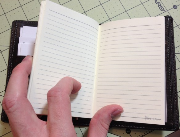
The book comes with two notebooks that I’ll cover first. One is a small, journal-type book, and the other is a tear-able (not a pun) pad. Both are good quality paper that’s fairly smooth, and can stand up to some fountain pens even, but they’re a bit stiff. They fit snugly into the slots on the cover and never seem too intrusive or fattening. Replacement books and other styles can be bought individually, and they are still good even if not protected in the cover.

photo-57

The cover has a leatherette feel to it (I don’t know the material) but it’s pretty strong and the spine is designed to be flexible so it doesn’t look bad or get destroyed by being opened and closed a lot. On the outside there’s nothing but stitching and a subdued logo, which I like. On the inside there are two panels, each has an inside-facing, and outside-facing pocket that are about business card size and can hold the notebook covers. One panel then has three card slots for business/credit cards or the pad, and the other side has only one slot for either the pad or any other item that FiloFax made to be put in there (I suppose cards would work there too, but there is only one slot). Finally, it comes with a thin piece of cardboard with a pen loop attached that can be inserted into the back pockets, allowing for one to easily take their pen with them.

photo-60

I personally have: business cards, cash, a small pen (Monteverde Poquito stylus), and all of the included items stored inside. The cover has held up well, with no signs of wear yet, and while I rarely use the books because I have so many other ones (and I’m not a fan of jot-pads) they do come in handy and can take inks that many cheaper papers can’t. I’ve had no problems with the spine or the pockets, and the stitching is still all there. I wish it was a little more customizable, but I wish that about everything.

The Flex is a quality product, as a wallet, organizer, or notebook. It is very customizable and very hardy. If one’s needs change, the Flex can change with them, and it seems to be built well enough to last through those changes. I really like it, and wish it was more widely available here (it might be now: I need to check up on it). It is on the bulky side, so it’s not for the minimalist, and more customizable options would be nice. But unless I see something great I’m not on the hunt for another wallet.

Book Review – The World Encyclopedia of Dinosaurs & Prehistoric Creatures (By: Dougal Dixon)

The World Encyclopedia of Dinosaurs & Prehistoric Creatures is a 2007 (Updated occasionally: my copy says 2014) illustrated encyclopedia of exactly what’s in the title, with Dougal Dixon’s name on the front.

51IZ-CufCLL._SX258_BO1,204,203,200_
Now I’m not a dinosaur expert (though when I was in elementary school I had a business card that said I was. I was a weird kid) but I do like dinosaurs, (and I never felt like pop culture did them right, save for Jurassic Park, which I know is unrealistic thanks in part to books like these). And I can’t go and fact-check all of this info, but from what I’ve seen from multiple sources, it seems to be fairly correct.

I’m not going to lie, though. I haven’t read the whole thing cover to cover, but people who read encyclopedias from cover to cover are crazy people. But from what I have read, I have determined that the book is informative and well written. It is very complete in the amount of entries, also containing many non-dinosaur species (really dinos are the selling point, though), but less complete on the individual entries. I know that is because we know very little about some of them, but I always found myself wanting more descriptors. It still tells you a lot of things about a lot of prehistoric animals, and is a very good and complete reference.

But speaking of reference, my favorite part of the book isn’t really the words , but the massive amount of artwork it contains (everyone’s favorite part of every dino book). There are a thousand entries, each with its own unique artwork, and other supplemental artwork here and there. It is all beautiful (if a bit featherless, in light of recent discoveries), especially in scope. If one wants to draw dinosaurs, here is an amazing set of reference materials. And the paper they are printed on, while not the best, is very good and the images really do pop.

So as a reference, both for the text and visuals, this book succeeds. The price for these types of books is always a bit much, but for the amount of work that went into it, it’s hard to argue with it, especially since this one’s price isn’t really that bad. If you like dinosaurs and prehistoric creatures (drawing them or reading about them) then this is certainly a book to look in to, and if you can find a deal on it (like I did) I wouldn’t pass it up.

Review – Expo Ultra Fine Pink, Purple, Orange, and Brown

I’ve looked at the 4 most common Expo marker colors (specifically in the Ultra-Fine tip) in the last few weeks, and this week I’ll look at 4 of the lesser-seen colors: pink, purple, orange, and brown.

photo-52

Pink- to start with, the pink is a nice, dark pink that looks much more pleasant than the common pinks found in writing utensils. It’s rosy, and very consistent; the line width is medium, though.

Purple- next, the purple is a very bold writer, it goes on smoothly and with a lot of ink, but there is more variance in the color when dry. It is a nice, dark purple, and unmistakably so. It might be confused with black from far away, but is generally distinguishable.

Orange- the orange is very thin, both in line and in color. It’s sometimes hard to tell it’s there at all, and there is a wide color variance within it. I’m not a particularly big fan of it.

Brown- and finally the brown, which is another wide-writer. It writes smoothly, with the only color variance being in the tips. It’s a dark enough brown to be easily read, and still distinguishable from the other dark colors.

Overall, these 4 are a nice addition, though they aren’t my favorites, either in performance or in looks. I like them, but if I were just getting these for a class I would skip them. For organization, note-taking, and art, these colors have a better purpose, but those aren’t the main purpose of dry-erase markers.

Book Review – 1,339 Quite Interesting Facts to Make Your Jaw Drop (By: John Lloyd, John Mitchinson, and James Harkin)

1,339 Quite Interesting Facts to Make Your Jaw Drop is a simple book. As stated in the title, it contains 1,339 facts (I’m fairly sure, I didn’t count, but math tells me there should be 1,340, so maybe there is one lie). They are collected 4 to a page and “organized” in a stream-of-conscious style.

20723817

The facts aren’t quite common knowledge, though likely the reader will be familiar with some. Some of them are easily verifiable, and there are no real stand-out lies or debunked myths. It’s entirely possible that some of the things presented inside are false, but they do include a link to a website where you can submit any proof you have that a statement made in the books is false. Out of the whole thing, I only found one fact that seemed dubious to me.

In the back there is also a handy index in case you’re looking for where you read that one thing a year and a half ago that you swear to your friends is true. Which is nice, as the lack of chapters would make navigation of the book otherwise difficult. Nothing presented requires much special knowledge to understand (one might have to do a quick Google search or two), and retaining anything is easy as everything is presented in a few sentences. There also aren’t too many offensive or morbid things included (it depends on how broadly you’d want to define that.)

It’s a fun little book to read through, and then sit on the shelf and open up to a random page now and again. My jaw never did drop while reading it, but I was certainly amused when doing so. I enjoyed it, and will enjoy keeping it around.

Review – Expo Ultra Fine Red, Green, and Blue

Last week I looked at the Ultra-Fine Expo markers as a whole, and the black color specifically. This week I’ll look at the more common colors in most dry-erase ranges in this size and brand, and see how they work.

photo-52

Red- The color red is a problem with many pens, and dry-erase markers are no exception. The red goes on smoothly enough, and is one of the thinner “sticking” inks. The lines it makes are solid, but the shading and their thin-ness is more pronounced. The color is also quite washed out and pink, which I’m not really a fan of, but seems to be a theme in reds.

Green- The green is one of the thicker and smoother colors. The lines are bold and solid. But the color, while pleasant, is also washed out. While it is definitely in the green spectrum, it’s more of a sea-green or something similar.

Blue- And finally the blue. In writing characteristics, it’s more of a mixture between the other two. The lines aren’t as bold or thick, and it’s not quite as smooth as green, but more so than red. The color is the most true and least shading of the bunch. It goes well with the black, and is easy to read even from far away, though it isn’t too dark.

The first set of colors is standard, and while lackluster, they get the job done. I can’t really complain as they weren’t created with art in mind, but rather for ease of use and low odor, which they have. Next week I’ll take a look at some of the less-standard colors available in the lineup.