Book Review – How To Traumatize Your Children

How To Traumatize Your Children is one in a series of intentionally dubious “how-to” books by the publisher Knock Knock. Artfully called the “self-hurt” series, these books are put together like a standard how-to or field guide, but cover topics that one would likely rather not have happen. So it’s all a joke, kindof, and if you see the cover and think it looks funny, you’ll probably think it’s funny.

The construction of the book itself is very nice, with a plastic-y feeling cover that reminds one of water-resistant guidebooks or first aid manuals. It’s a nice size and it feels good in the hand, being both substantial and slightly textured, though it is prone to creasing, and when it does it is quite unsightly. The pages are nice and thick, with a substantial binding that really locks everything in place. The presentation is just really nice and evocative. I’m a fan.

Unfortunately, once inside things start to go downhill a little bit. The book is divided into 10 chapters, 7 of which are various types of parenting styles, bookended by an introduction and conclusion like this is some kind of essay. It starts off pretty funny, with an interesting rationalization for the book’s existence at the front and a nice step-by-step guide on how to traumatize kids in different ways. The first problem here is the graphic design: little yellow “bubbles” with competing thoughts start to pop up in chapters as little asides, but these quickly start coming in between connected paragraphs, or in some case in the middle of paragraphs, running the flow of reading into a brick wall at inopportune moments. And the second is that the joke gets old pretty fast, and the writer(s?) makes no attempt to get more creative with it as time goes on. While the book lists many “different” parenting styles, they all end up being described in the same way, and the list of effects they have on the children is essentially unchanged each chapter. There’s nothing new, it just keeps talking and talking and talking. If I had read the introduction, two middle chapters at random, and then the conclusion, I would’ve gotten all this book had to give me, and maybe even had a better experience.

It’s not too egregious, and I wasn’t frustrated or angry as I continued, but it just got boring. And for a book that is basically a joke, that’s forgivable. I don’t think anyone was really intended to read the entire thing. It seems more like something you’d leave lying around for when guests come around, or give as a gag gift (or get tricked into buying at a store) that someone will pick up, laugh, leaf through a few pages, laugh again, and then put down. And it does that quite well. Whether or not that’s worth the cover price is up to you.

I was disappointed, but only mildly. My expectations for a book called How To Traumatize Your Children were justifiably quite low, and this book actually surpassed them for a moment in the beginning, but failed to live up to its own promise. It’s a well put together item, with well done if… lifeless artwork, and questionable graphic design/layout. The contents are funny, but not too funny, and maybe at bit too cynical. It just left me really ho-hum on the whole matter. If you read the title and thought it sounded funny, this might be the book you’re looking for, but it really has nothing more to offer than that, and to some it might still fall flat.

Book Review – Of Mice and Men (By: John Steinbeck)

I must say before getting too far into this review, that Of Mice and Men is my favorite book, and has been for quite some time. It probably has the award for the book I’ve read the most times, but for me “more than once” is a rarity. I’ve been using the book as a benchmark for what makes a good book since I first read it, but is had been some time since my last (subsequent) reading, and I felt I needed to refresh my memory. I must say I was not disappointed.

At the risk of potentially sounding more biased than I already sound, I believe I can safely say that my barometer for what is a good book has been reset so high with this one that I almost feel myself going “why do I even read other books? Couldn’t I just read this one again and again forever?” Even from the very beginning, which in and of itself is a master’s course in how to do exposition, I was wrapped up and engrossed again. Of Mice and Men does not wait to hook you, or need to spend pages of setup to allow you to understand it. At only a little more than a hundred pages it doesn’t have time for that. You are there, and it has you, and it will not let go.

The story is one of Steinbeck’s California workers’ collection, about two men: George and Lennie, who are working bucking barley in the hope of saving up enough money to buy a farm of their own. Lennie is big, strong, and “not bright”, while George is slim, quick-witted, and… harsh I guess. They were “kicked out” of the last place they worked at because of a misunderstanding with Lennie and now they’ve just come to a new place where they only have to keep a low profile for a little while in order to get their money and get out. Of course as the title alludes, these plans “often go awry”.

The rest of the cast of characters is pretty small (indeed, the book was meant to be half-novel, half-play, so it stands to reason): there’s Candy, the one-handed “swamper”; Curly, the boss’s son who’s “just mean”; Slim, the cool-headed team leader; Crooks, the “negro” stable-buck; Curley’s unsatisfied wife, and Carlson; a man who has a Luger (and a couple of other people there for convenience). Most are simply stereotypes, but instead of that being a “narrow-minded” or “easy-way-out” writing trick, here it is used as a way to introduce characters and themes without having to go into too much depth in the setup, allowing for more depth subsequently without bloating the size. For instance, Crooks isn’t just “cursed” to be black, but crippled, and his separation from the others gives him both a certain amount of freedom and a certain amount of dependence. And Curly’s wife (only identified as such) is a “flirtatious” “tart” but she had to settle for the life of a farm as opposed to the social life of an entertainer she yearned for.

With very few words, the stereotypes turn into people, understandable and empathetic people. One could suppose that there is an antagonist, and most would call our main characters protagonists, but in the end it’s just a story that happens to have them as the center. The book really gives the impression that things are happening because things happen, bad and good, to people, bad and good. There isn’t anyone malicious planning everything or being a villain “because”. It feels real, like you know these people and this actually happened.

And in my mind, my words don’t do it justice. I keep mulling over time and time again what exactly it is I have to say about this book, or how much there even is to say. really, and I come up with so many things that just never go down on paper quite right. It’s hard to express how much I enjoy it. Even with its flaws (both typographical and narrative) it just stands head and shoulders above any of the competition for me. It works, and it works as a story that is relatable on so many different levels for so many different people: for farmers, for workers, for friends and family, for planners and dreamers. It’s a cautionary and sad tale, but realistic. It doesn’t wallow about in its misery, it moves forward, as people tied to time are forced to do. Sometimes it’s a bit fast, and the transitions don’t always feel like they’ve adequately explained the amount of time that has passed (if any), but if picks it back up so fast after that little fumble that one barely notices it.

With my opinion already fairly obvious, I’ll say I’d recommend this book to most people. There are a selection of people who prefer very specific genres, books about non-serious topics, and who really don’t like less-than ecstatically happy endings. Those types of people I would not recommend this book to, but it’s not often I find one of them around. And even if one doesn’t enjoy the book it can be finished in a few hours and you’ll likely take away something major from it.

Mini Review – Peruvian 2B Pencils

At this point, I’ve gotten through the reviews of most of the non-U.S. purchased products I’ve received. But down at the bottom of that list are these simple little nameless pencils that came from Peru in what I understand was a larger bundle. And I’d like to take a quick look at them before moving too far beyond.

The body is your standard yellow, hexagonal fare, without a ferrule or eraser at the back, replaced with a white band and then a black “cap” of paint. The only other adornment is “2B” stamped in a gold color. They come pre-sharpened, and thus a little shorter than your average pencil, being around 7”.

The lead is a 2B, so it’s a little softer than your #2 HB’s, but it’s far from too soft, and the difference is really hard to tell. That probably stems from it not being a very well refined graphite, making it more toothy and gritty than one would generally expect from this hardness of pencil.

The build quality is work-able, with the wooden body being quite sturdy, and the absence of an eraser making things easy. There is some variance in how well the lead is centered, though, making sharpening sometimes difficult. In the end they’re what you’d expect from a cheap no-name pencil, but they get the job done.

Book Review – Lost in Translation (By: Ella Frances Sanders)

As a person who is often searching for the right word and has a tangential interest in learning single words from foreign languages to add to my speech, Lost in Translation: An Illustrated Compendium of Untranslatable Words immediately interested me. I don’t know how I first came across it, but it was already in my online cart when my mother found a copy at a second-hand shop and I was prompted to finally pull the trigger. The book promises a definition and illustration of more than 50 words from various languages that have no direct translation in English. But are these words as far out as they seem?

Now, I’m not a linguist, but I think it’s fair to say that words with no direct translation are fairly common, especially when one considers a word’s connotations. Of course, we the readers don’t want the mundane minutia of the various connotations of words that may or may not have ostensibly direct translations, and this book does skip all that and get right to the words you never thought there would be a word for. But sometimes the connotations of a word in its foreign language creep back in and muddy up the waters a bit.

Each word is given a two-page spread with an explanation (including the language it’s from and whether it’s a noun, verb, etc.) on the left hand page, and a definition worked into an illustration on the other. The artwork is simple and emotive, having a child-like or “homemade” look to it. It looks a bit stiff at times, but I enjoy the style, and, with few exceptions, it helps guide the reader to the “feeling” the words are trying to convey. I would understand the argument that the artwork can make the book hard to read, but I personally didn’t have this problem.

The book starts out pretty well, specifically with “pålegg”, meaning: anything you can put between slices of bread. And following that are several equally interesting words that quickly bring the question to my mind of “how many people in these languages actually know these words?” I mean, as an English speaker I can get along entirely fine without knowing what “akimbo” means, as I’ve never heard it spoken by anyone, and can’t remember reading it in any text that wasn’t defining the word. I only remember it because I have a fairly good memory for useless things (like how to pronounce “Van Gogh” in Dutch), and it seems probable that if there was an English word for “the roadlike reflection of the moon” that most people wouldn’t understand you if you used it.

That doesn’t mean these words aren’t nice little things to know, and they do make you think about the little things we could have words for if we wanted to, but just as I started getting used to that the book started sprinkling in some words from compound languages. Or rather languages that use a lot of compound words (think German). And I have a bit of a problem since, if directly translated, those words would just become two English words that would connote a similar meaning, for instance: if I said the words “blue smile” or “grief bacon” in the context of people being insincere or stress eating, you’d likely understand what they meant, and just because other languages happen to be able to combine two words more easily doesn’t make them “untranslatable”. It’s like that old myth/saying that the Inuit have over 100 words for snow or something like that. It’s technically true, but that’s because they combine words, so every type of snow or snow-related thing gets its own word. And I think that’s almost cheating in the context of what was being presented to me.

So I had a bit of a bad taste in my mouth as I started wrapping up the book (it’s only 50 or so “words” long). It just felt like an interesting exercise improperly executed. There were some words like Goya, meaning the feeling of getting lifted away by a story, but then those are followed by things like Szimpatikus, which has the same roots of several English words, and could almost be considered a direct translation of some slang versions of them. Even for such a short book, the balance seemed all wonky.

But when I reached the end, I found I had enjoyed myself, and probably in equal amount to what I had spent on the book, though it is teetering on the edge. There isn’t a lot here, and it does have some strange thematic problems, but overall the artwork is whimsical and the idea wonderful. I will be keeping the book by my desk when writing in case I need any inspiration for single words I’d otherwise have to put in a sentence, but I don’t know how I’d feel about it if I wasn’t a writer. It feels like an idea a publisher nabbed and printed before it was finished to prevent being scooped. I’d recommend that anyone give it a flip-though, if you enjoy it then you’ll probably want a copy. And until the day that it comes out, I’ll be hoping that someone else starts up a similar project to this book that doesn’t have the same disconnect.

Review – Crayola Crayons (120 Crayon Box Part 3 – Greens, Yellow, and Oranges)

And now it’s time for part 3 of this series (that is taking longer than expected) looking at all of the colors that come in the Crayola crayons 120 box set. This time it’s greens, yellows, and a few oranges; let’s take a look.

Jungle Green – Starting off, “jungle green” is what I can only describe as a “wet” green color. It’s not really blue-ish, but it just seems damp. The coverage is good, as most of the greens will turn out to be, but I’m just not sure how useful it would be for anything other than those weird sea-green shorts.

Pine Green – A theme with this first section of greens is going to be my wonder at why they were named that, and this continues the trend. While it is the color of some evergreens, I wouldn’t say this slightly-blue dark green represents pines. It covers kinda splotchy, but does make a good forest tree color, especially in the winter.

Jungle Green (Shamrock) – Now here’s going to be a little problem in this review; there is supposed to be another color called “shamrock” here, but instead I received a second “jungle green”. I do understand that this sort of thing is bound to happen, but I am a little disappointed and I hope it isn’t a common occurrence.

Asparagus – An unpleasant, yucky looking green that does indeed resemble some shades of asparagus (though not any I would be eating). It covers well enough and has much more shading ability than the majority of other colors in the set. Unfortunately its uses are quite limited and not on the nice side: like swamp yuck or vomit.

Tropical Rain Forest – Looking a little too blue for its namesake, Tropical Rain Forest is a deep aqua color. It covers fine and is a nice shading… well… shade. In tandem with other colors it works very well but little vegetation or really anything is around that will use it as a primary color.

Mountain Meadow – An oddly specific name for a rather plain looking green. Mountain Meadow is a slightly lighter and bluer color than regular “green”. It covers well in the normal range and has pretty standard green applications, though there aren’t any specific applications I can think of. It is a pleasant looking addition that adds some nice variation in shades (tints).

Forest Green – A color name that, along with “hunter green”, always confused me. This vaguely evergreen or dying-plant color covers poorly for a green and shades a little more than usual. While it isn’t a color that would be unused in the forest, it isn’t a usual main one and would be most at home coloring evergreens or parts of hunter’s vests.

Green – One of the standard 8 Crayola colors, Green is a very recognizable color with good properties. It’s nicely situated near the middle of the green spectrum and is suitable for all one’s foliage needs as well as for almost anything “green” made by humans. It covers quite well but has more pronounced darker spots than other colors in the area.

Fern – Vaguely fern-like, this pale green does a decent job of covering and highlights or lighter spots on plants. If I had been consulted I would’ve called it more of a “mint” myself, or “green army from Risk”.

Olive Green – Quite olive-colored (the green kind at least), and not really similar to military uniforms, I feel like Olive Green has a bit of a singular purpose. It isn’t the best at coverage and other than green-olives and pickles it looks a bit yucky.

Granny Smith Apple – Slightly darker in my experience than its namesake, Granny Smith Apple does resemble the famous apple skin and is a nice color to use in other plants or un-ripe fruits. It doesn’t provide the greatest coverage (being rather stipple-y) and will likely need a “support” color.

Screamin’ Green – And interesting name for a poor color, this neon lime green is an eyesore and not too great at coverage. Its uses would be limited to coloring neon signs, what one would write on black paper to make it “radical”, and perhaps radioactive waste. But I guess that’s more from a realistic perspective. Kids do like their neon.

Yellow Green – Much more green than yellow, Yellow Green is a light vomit-esque green color that covers decently but isn’t that pleasant to look at, though in the right light it could be the color of unripe fruit or changing leaves.

Electric Lime – The other neon green, Electric Lime is almost invisible on the paper and has very poor coverage. This is one where darker paper would be necessary and also the only use I could find for such a color.

Inchworm – Similar to Inchworms from children’s books, but not those from real life, this color covers well but has a bit of shading to go along with it. It could be used as a green highlight, for changing fruit or leaf colors, or, less pleasantly, for swamp muck in summer.

Spring Green – Another nearly invisible color that is much easier on the eyes. It is a vaguely green yellow that I could also call “autumn green” as it looks like grasses as they yellow in the fall or come back in the early spring. When colored in, it covers fine enough but has the consistency of grass and the green and yellow separate a bit.

Green yellow – An aptly named green-tinged yellow; Green Yellow is quite light and hard to see. It covers fairly well but with subtle shading that is hard to see at first. It is a good green highlight color, a likeness for grass turning yellow in the fall, and the color of some pears or apples.

Canary – A very muted yellow that is probably the hardest color to see in this section. I wouldn’t say it’s very good at imitating its namesake, but it does cover decently. I would still have a hard time trying to find a place to use it.

Almond – Not a dead ringer for either of the colors I associate with the nut, this Almond color much more resembles the off-white inside than the brown outside. In the end, though, I’d probably call it a very white yellow, perhaps an “eggshell”. The consistency (and thus the coverage) is very smooth and the uses are very interesting: cream, or eggshells, or sun-bleached something (paper?), but it’s subtle enough that it likely won’t be used to its full potential.

Yellow – Another one of the classics, plain yellow is a surprisingly deep and saturated yellow. The coverage is very good, and the shade is only slightly unnatural. It works well for many flowers (dandelions, sunflowers, etc.) and summer clothes, though on its own it is a little overpowering, and it needs to be augmented with other yellows.

Laser Lemon – High in my category of less-than-favorite is Laser Lemon, a particularly hard-to-see shade of slightly-neon yellow. It’s nearly transparent and the coverage is hard to discern but I’d say it’s patchy. It would make an interesting highlight or sign color, but that’s being generous.

Goldenrod – Goldenrod is a vaguely gold color that is more like a darker version of the following Dandelion. It’s the darkest/deepest of the yellows and as such is a tad on the messy side and its inconsistency doesn’t help. It’s a useful color for shading, darker flowers, and perhaps older plastics, but I don’t see it coming out often.

Dandelion – A bit darker than the flower it’s named after, Dandelion is a nice strong yellow that isn’t particularly pleasant, but also isn’t very yucky. It’s got great coverage but the layer has some inconsistencies and darker patches. It still looks fairly natural and is easier on the eyes than many yellows, making it good for large patches of the color, bees, flowers, and many human-made items like raincoats.

Banana Mania – This one sounds like a disease from a comic book, and is a much more orange/peachy color than one would expect from a “banana”. In fact it would work well for small fruits like apricots and peaches in their various forms as well as skin tones, though not as well, since, while it does cover well, it covers unevenly.

Unmellow Yellow – Like Laser Lemon but a bit more yellow and less neon, Unmellow Yellow has a terrible name that doesn’t really evoke a color in my mind. This one is hard to see, and hard to find uses for, looking both unnatural and unlike many man-made objects. The best I can come up with is yellow on TV/computer screens and the like. It does almost look like it’s glowing with its decent but incomplete coverage.

Sunglow – The name here is a semi-accurate description for this morning-ish orange color. It’s very light, almost fluorescent, and covers quite poorly, but it is a good rising/setting sun or hot coals kinda color.

Atomic Tangerine – These names aren’t getting any easier for me, but this one is apt. This color has minimal coverage and a “neon” quality, but it is actually dark enough to see on the paper and would be vaguely reminiscent of a tangerine that happened to get irradiated. Low sunset or safety vests is about all I can think of here.

Macaroni and Cheese – I’m gonna call this one flat wrong, and if you have macaroni and cheese that looks like this it might be tasting a bit funny. This slightly brownish orange covers quite well but I have a hard time placing it. Maybe those orangish brick buildings or left-out grapefruit peel.

Neon Carrot – Very similar to Atomic Tangerine and perhaps a little on the light side for its name, this color has passable coverage and is hard to see, being both very light and lacking that punch the other neon colors have. Its uses are very limited and it just seems to lack purpose.

Outrageous Orange – A real safety vest color, this one has quite poor coverage and high shading, making getting an even “coat” almost impossible. It is a neon-ish color and would do well as the tape used by surveyors or blended into a sunset, but it lacks a natural look.
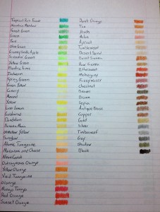
And that’s another 30 colors down, and in my opinion they were a bit disappointing, and without many uses. Next time we’ll be finishing up the set with the final 30 from orange to earth-tones (much more useful) and taking a look at the included crayon sharpener.